Black/Fashion: Color and Culture
In collaboration with the Boston Museum of Fine Arts, fashion curation by theo tysongraduate studio | first year fall ‘25
Worked with a fashion curator from the Boston MFA, theo tyson, and designed a Black/Fashion: Color Culture exhibition space in the Linde Family gallery in the museum. Throughout the semester, I explored the breadth and depth of black as a color and Blackness as a kaleidoscopic identity contextualized through fashion and visual arts, both historically and contemporarily. We were entrusted to ideate a design solution following her curatorial statement into 6 distinct sections: Good Mourning, Good Evening, Texture, Protest Dress, Kaleidoscope, and Afrofuturism. My project statement is inspired by the term "Sunday Best," which is a phrase used by Black Americans during times of oppression and marginalization as an expression of freedom during Church services, when they would dress themselves in their finest clothes.

Process
“The grid” is a design guide to break the space symbolically and physically. Breaking the black as a monolith to redefining it as Black as a culture.
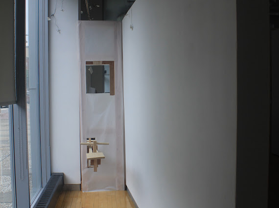
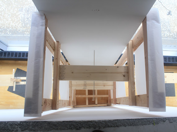
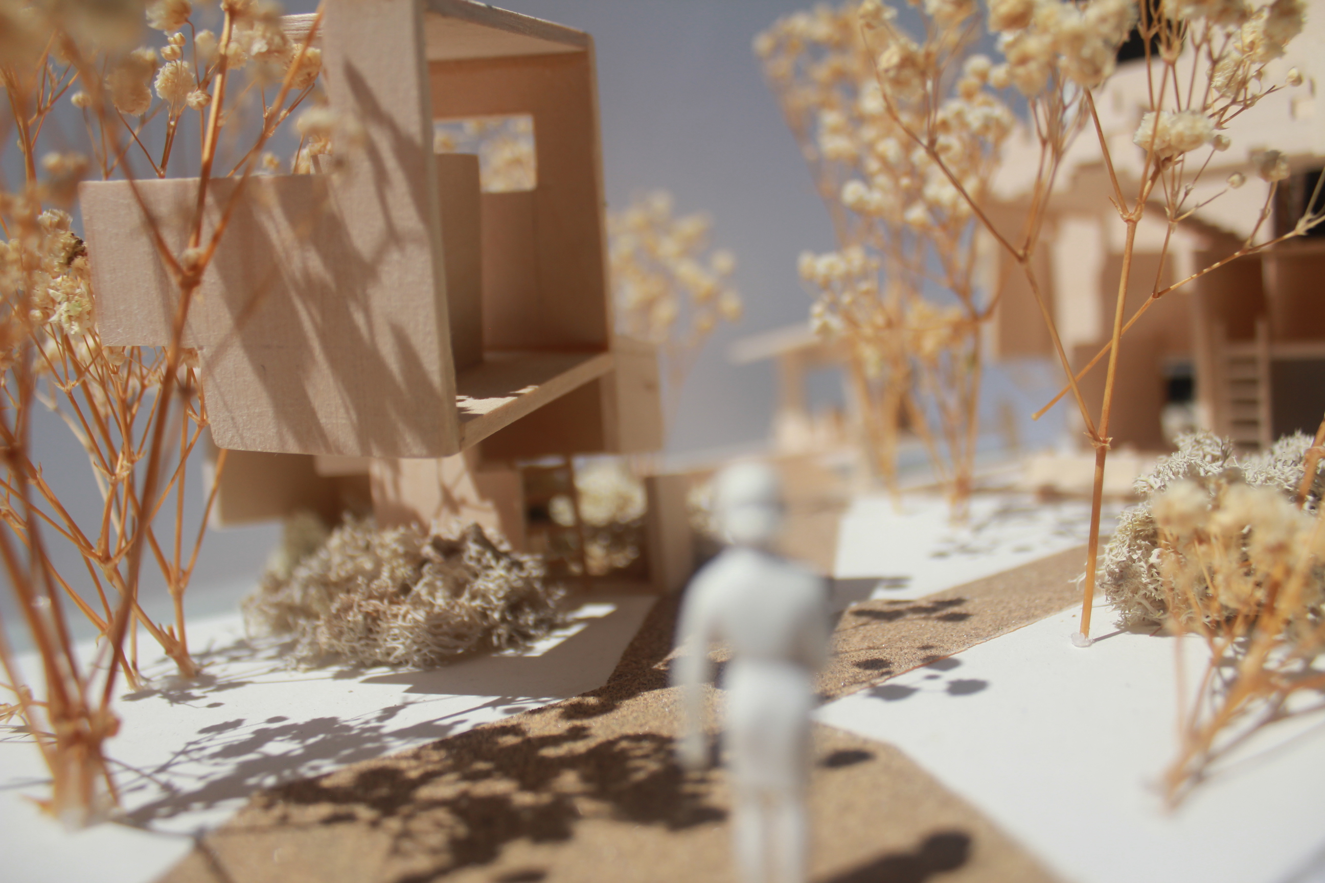
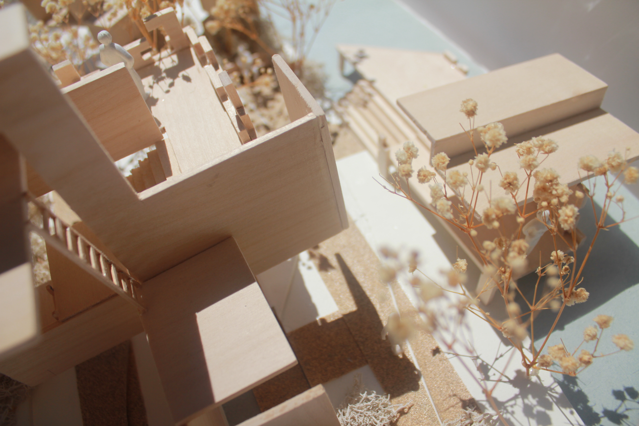
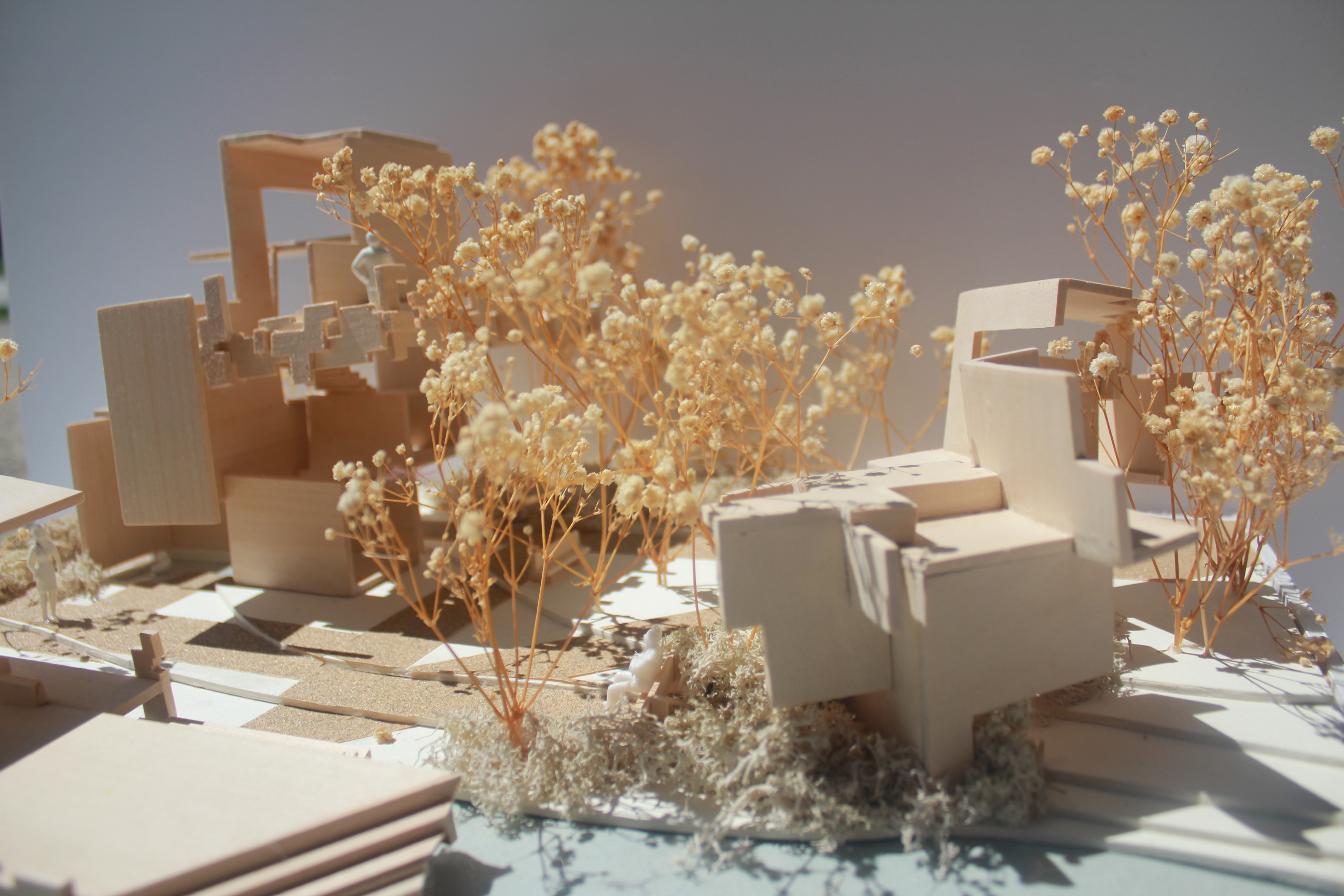
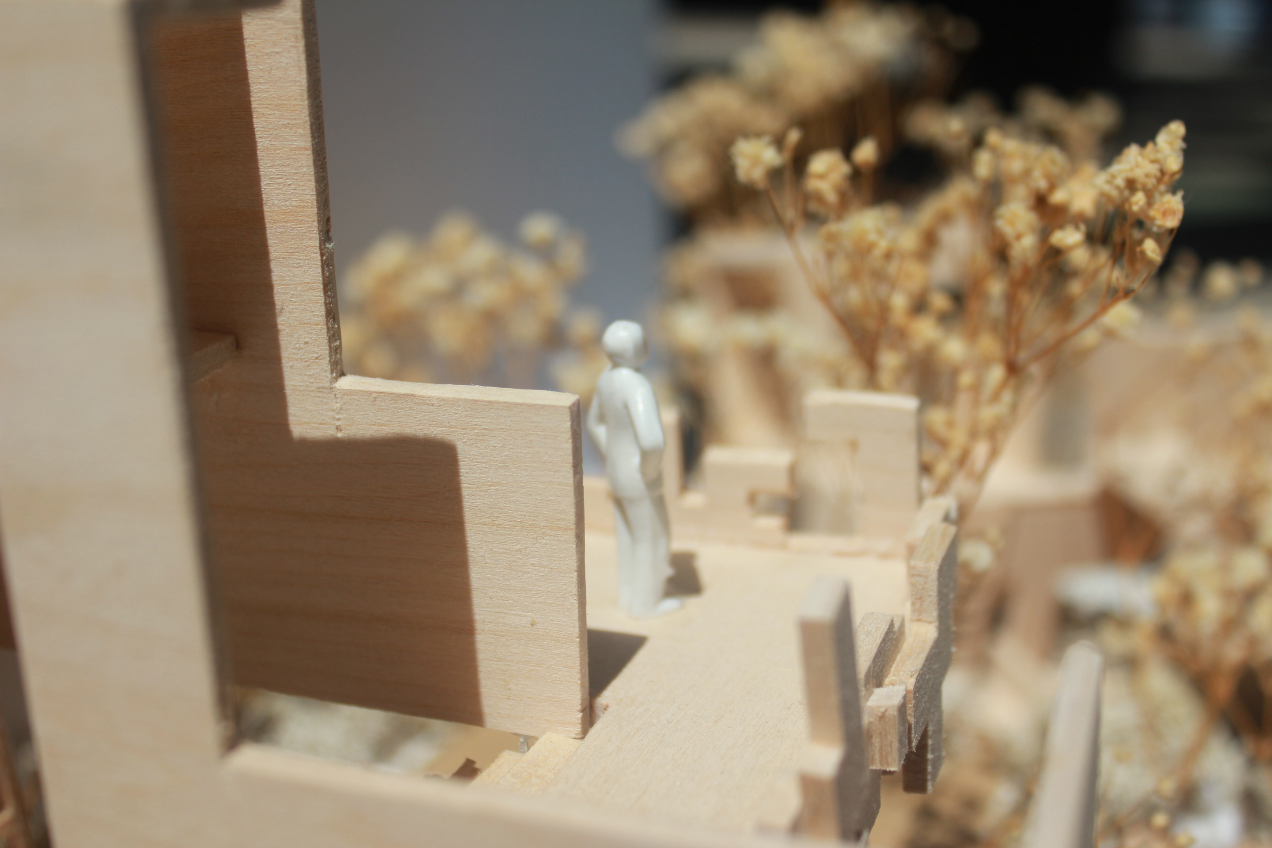
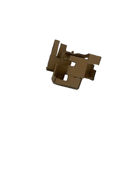
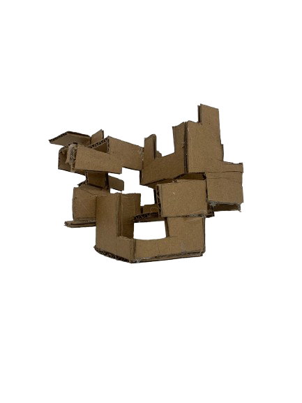
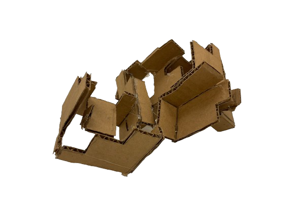
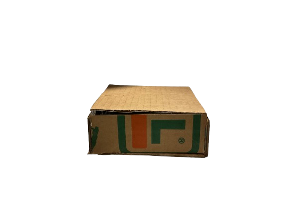
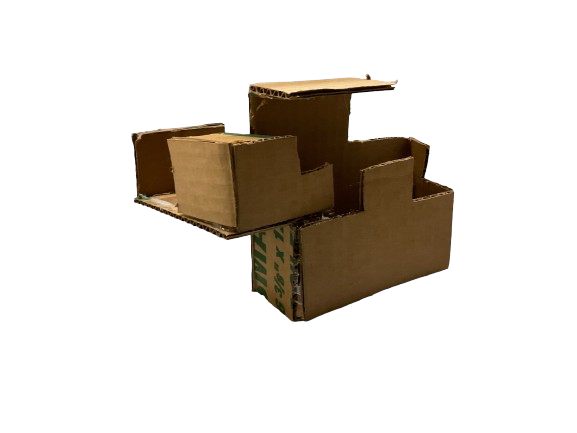
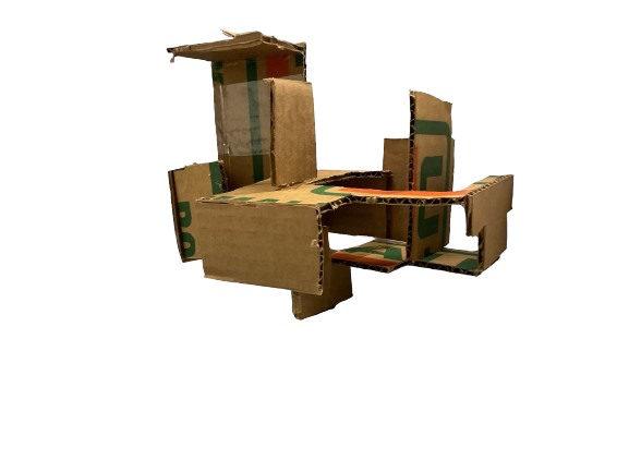
Within my practice, I iterate best when making models to express my initial ideas. These models above represent past iterations of my previous designs before reaching the final design.
Renders

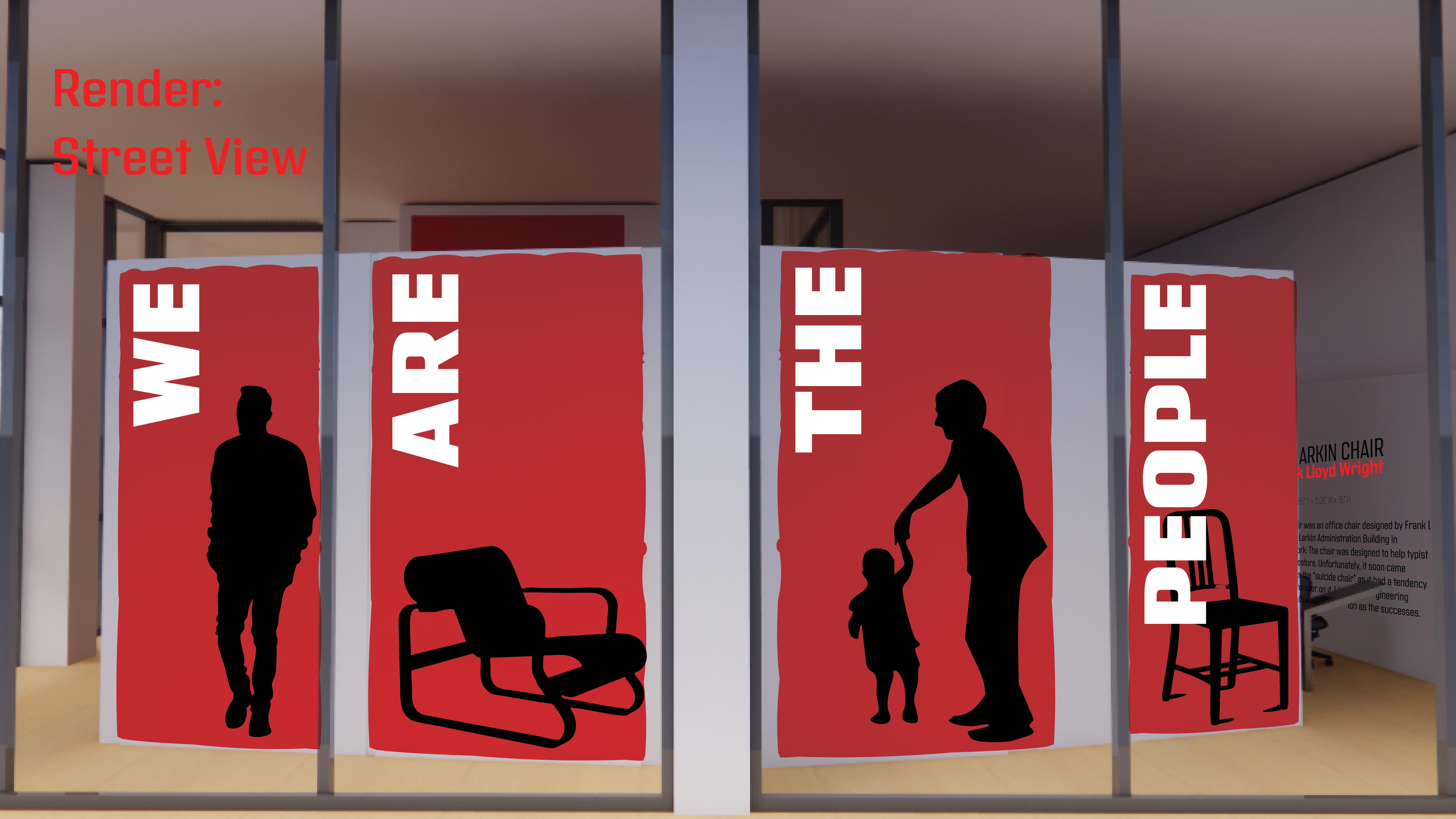
Render of the entrance leading into Good Mourning and Good Evening.
 Render of Texture leading into André Leon Talley’s cape as the transition into culture.
Render of the Kaleidoscope section.

Render of Afrofuturism into the reading room and exit.
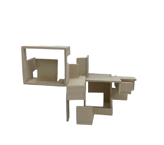
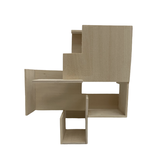
Final Models![]()
Final Presentation Wall
![]()
>Link to Black/Fashion Bible<
In a society where Black people are denied individualism and faced with oppression, dressing up in “Sunday Best” to Church was and continues to be a symbolic practice of self-expression. Therefore, this catalogue serves as a “Fashion Bible” containing all the objects within the exhibition.
15 Rules for Rebuilding the World
graduate seminar | first year fall ‘25
Architect Christoper Alexander released in 2004, written over the course of three decades, The Nature of Order: An Essay on Art of Building and the Nature of the Universe. The four-volume set outlines the properties that Alexander believes underlie beauty in art, nature, and architecture. This exhibit will be the abridged 3D version of his manifesto.
Quilts are a medium of design that can depict beliefs, commemorate, and educate the public on human rights violations, as well as represent groups and oppressed peoples. By placing quilts and equality quilts, it creates a dialogue between the two types of pieces within the same medium, showing its range.
Entrance Render

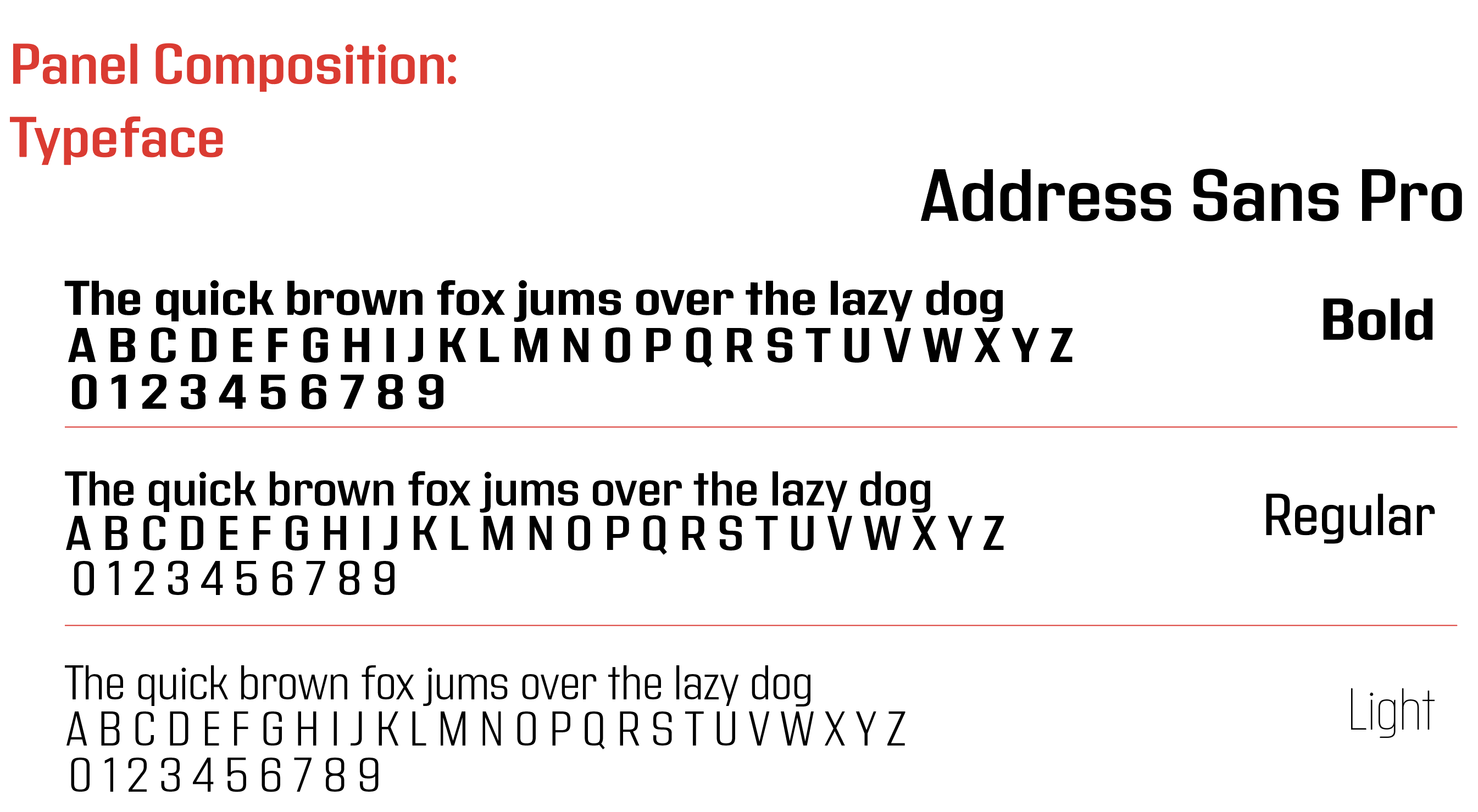
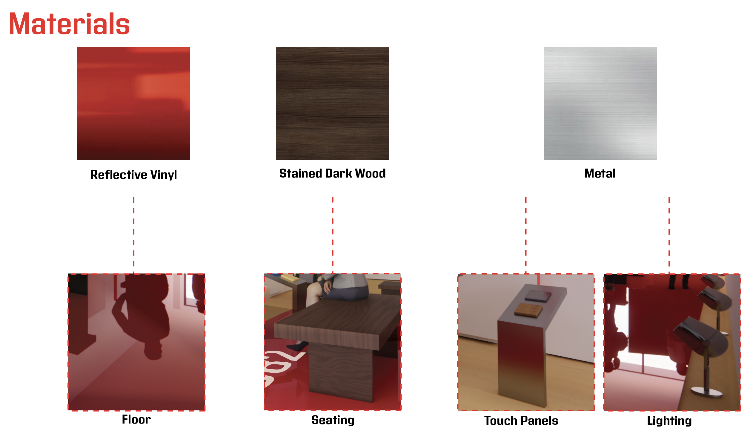
Panel Composition and Drawings


Renders


Model

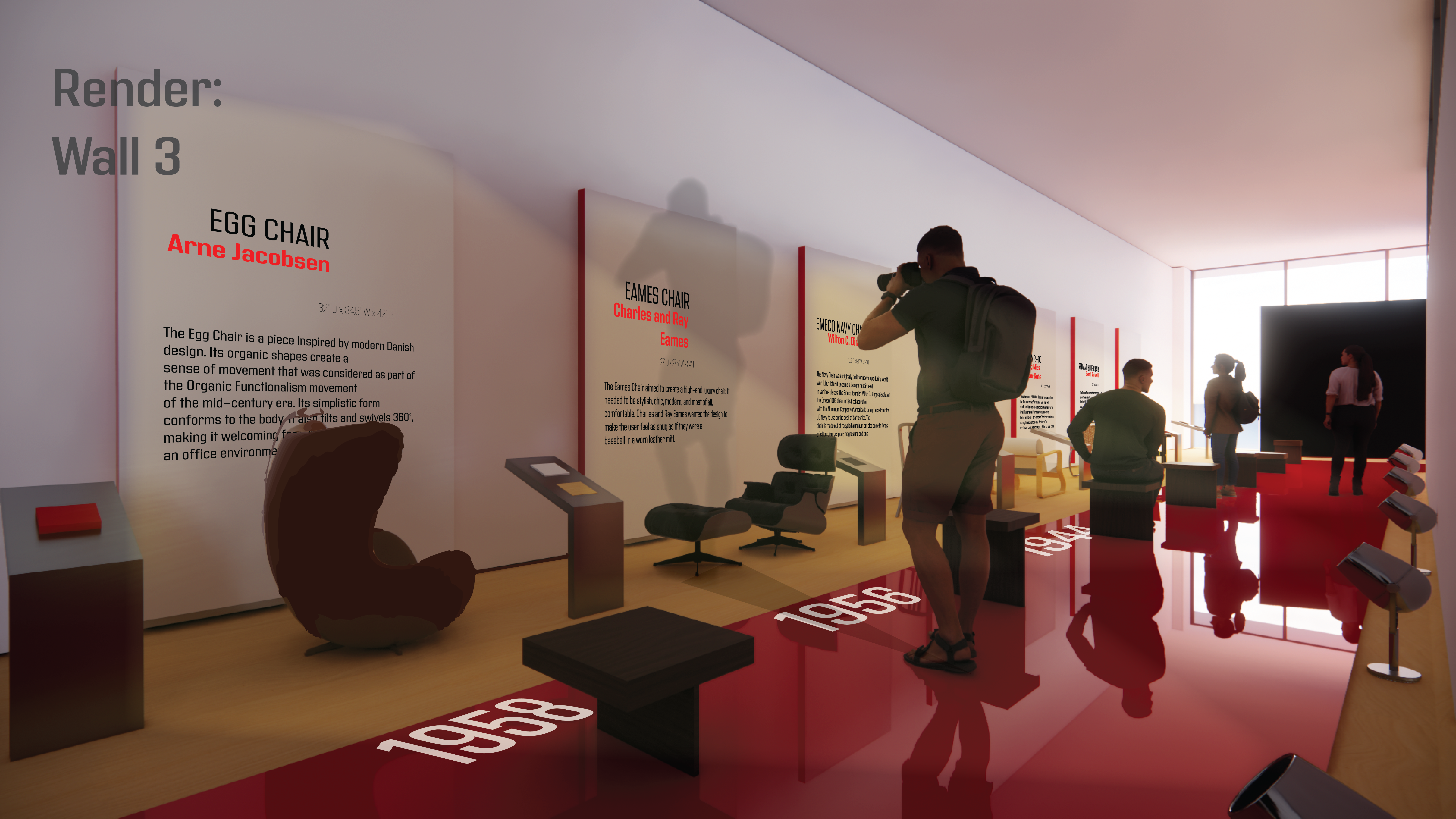
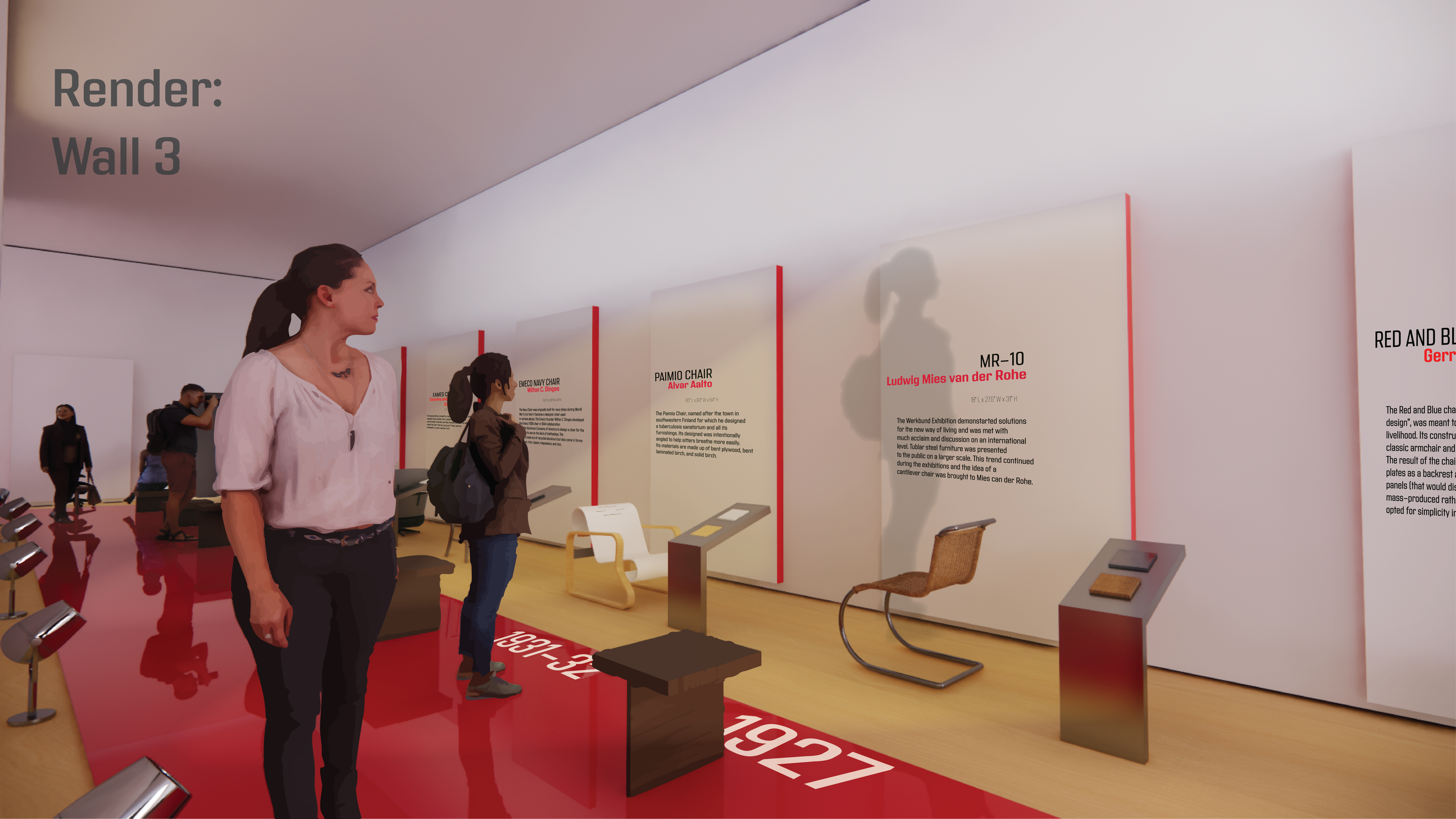
Design Icons 1900-2020
The Art of Sittinggraduate seminar | first year fall ‘25
The Art of Sitting takes the gaze from the chairs as objects and focuses on the array of individuals who occupy them-loungers, perchers, thinkers, and nappers alike. A chair’s composition is shown through its design and style, but its true artistry is present when in contact with human form. The exhibition celebrates the sitter as an impromptu player in this duet, transforming an object of design into a vehicle for labor, repose, argument, or escape. After all, a chair without a body is not a chair at all; it is the human who gives it purpose.
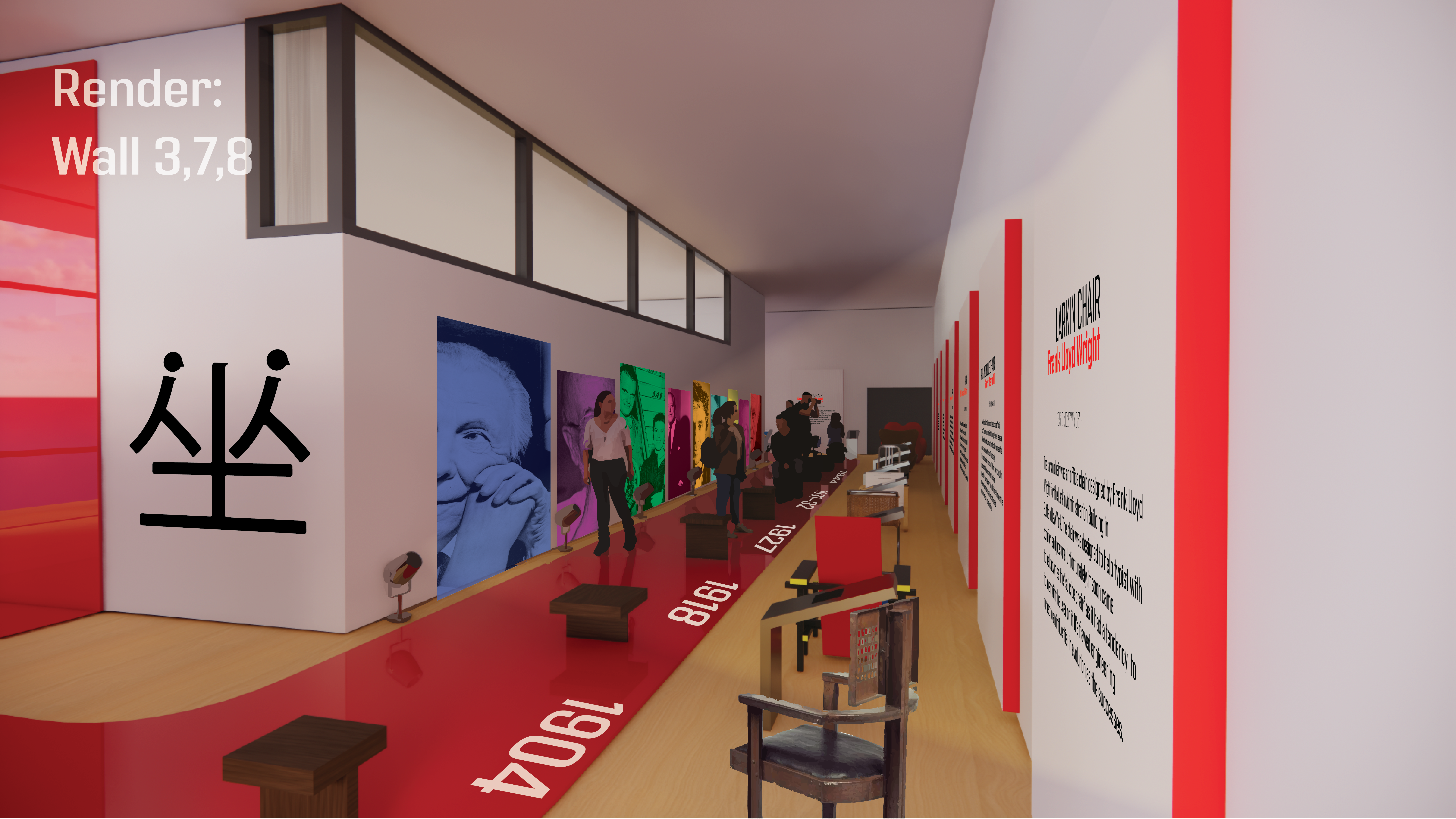
To say “to sit” in Chinese is Zuò. The character is represented here as it plays into this statement of focusing the sitter as a focal point of a chair’s design. Reiterating the character to transform into a human.
Model
Process Sketches

Panel Compositions and Drawings


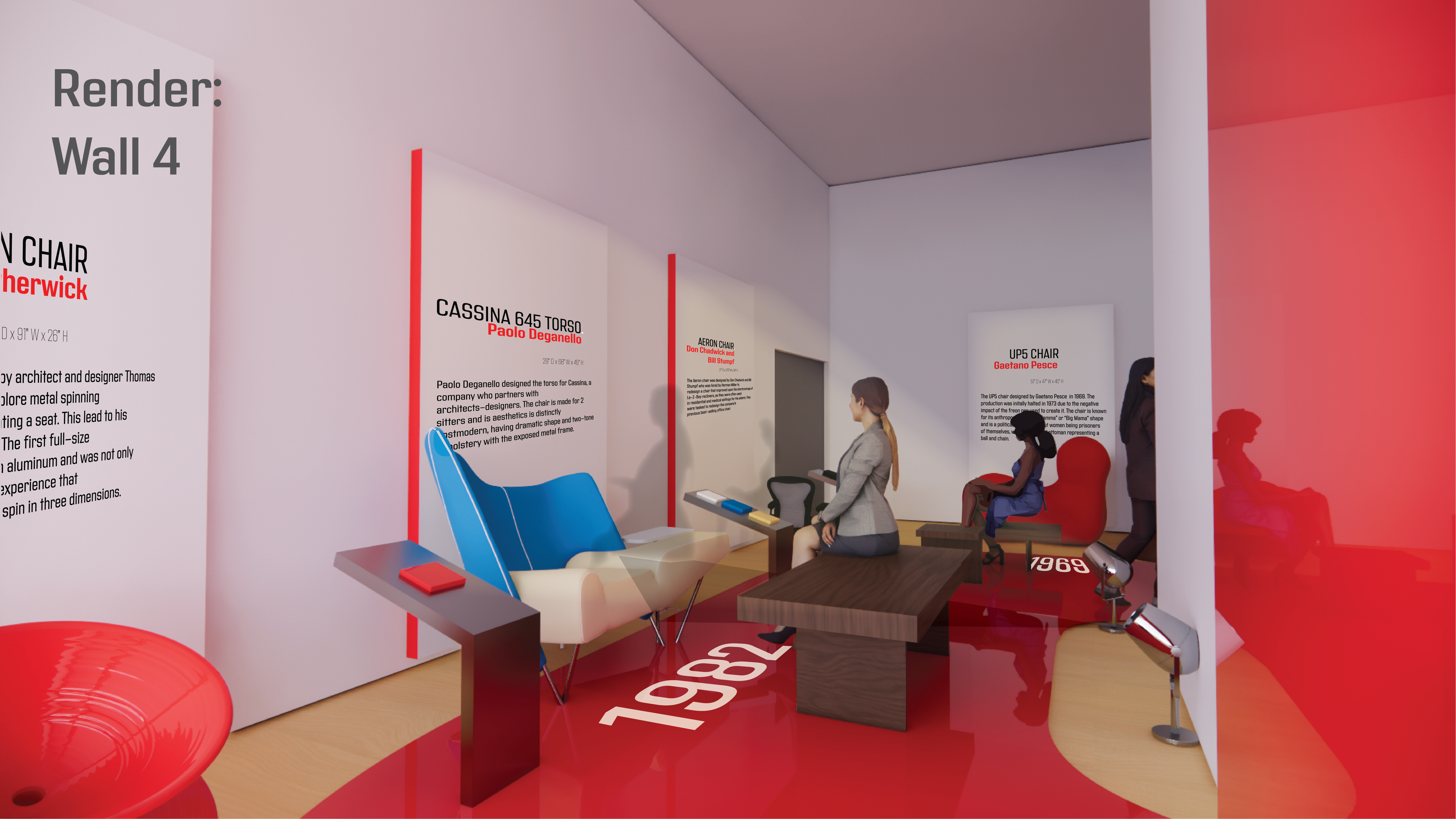
 The light acts as a participatory element within the exhibition. As the viewer sits on the benches, the light reflects the visitor’s shadow onto the chair on display. Mimicking the effect of the visitor sitting on the chair.
 Renders


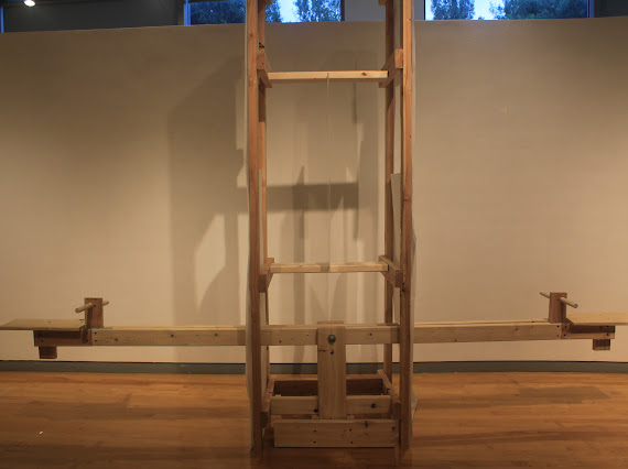
See/Saw
Mia Larkin, Madeline Thomas, and Emma Davis
graduate summer semester | summer ‘25
This final project draws inspiration from Allan Wexler’s Wall: I Want to Be Architecture, a quietly radical work that seamlessly blends construction logic with sculptural intent and spatial play.
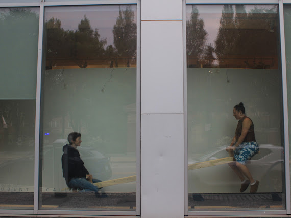

>Video Link to See/Saw<
Balance
“Unity in Opposites”
studio 4 | senior fall fall ‘24
This design studio is synthesizing the lessons learned in prerequisite studios. Integrating previous studio concepts, we are asked to develop and execute a design process that will culminate in a design solution for a small facility located in Regent Square, specifically Frick Park.
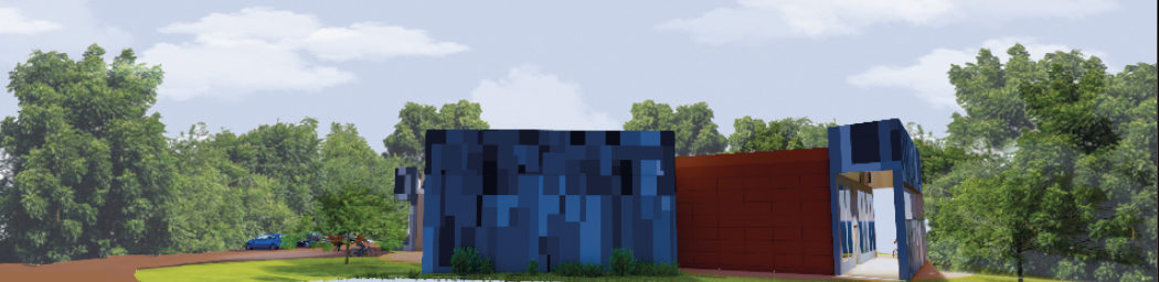
Render
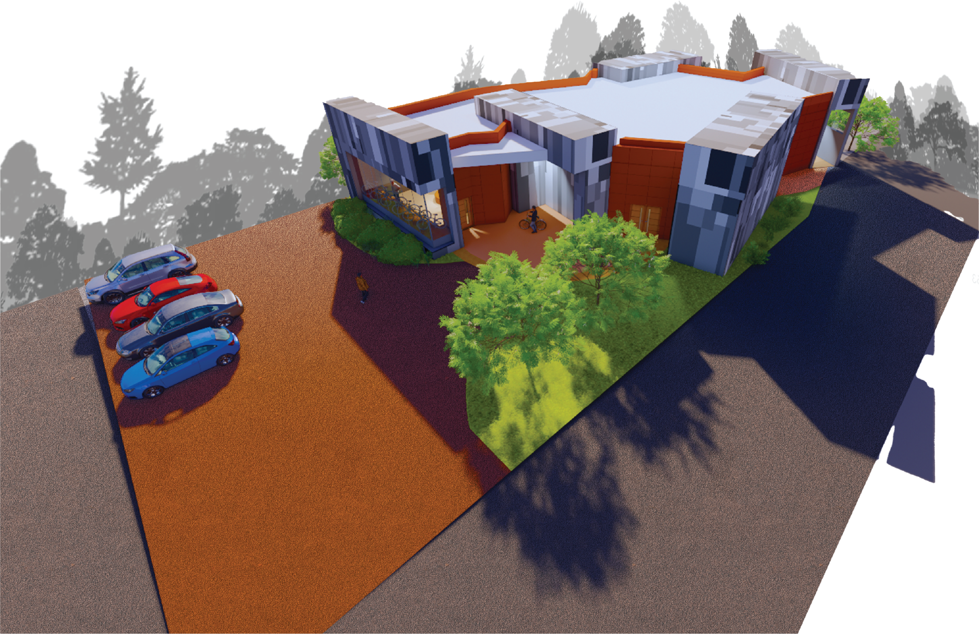
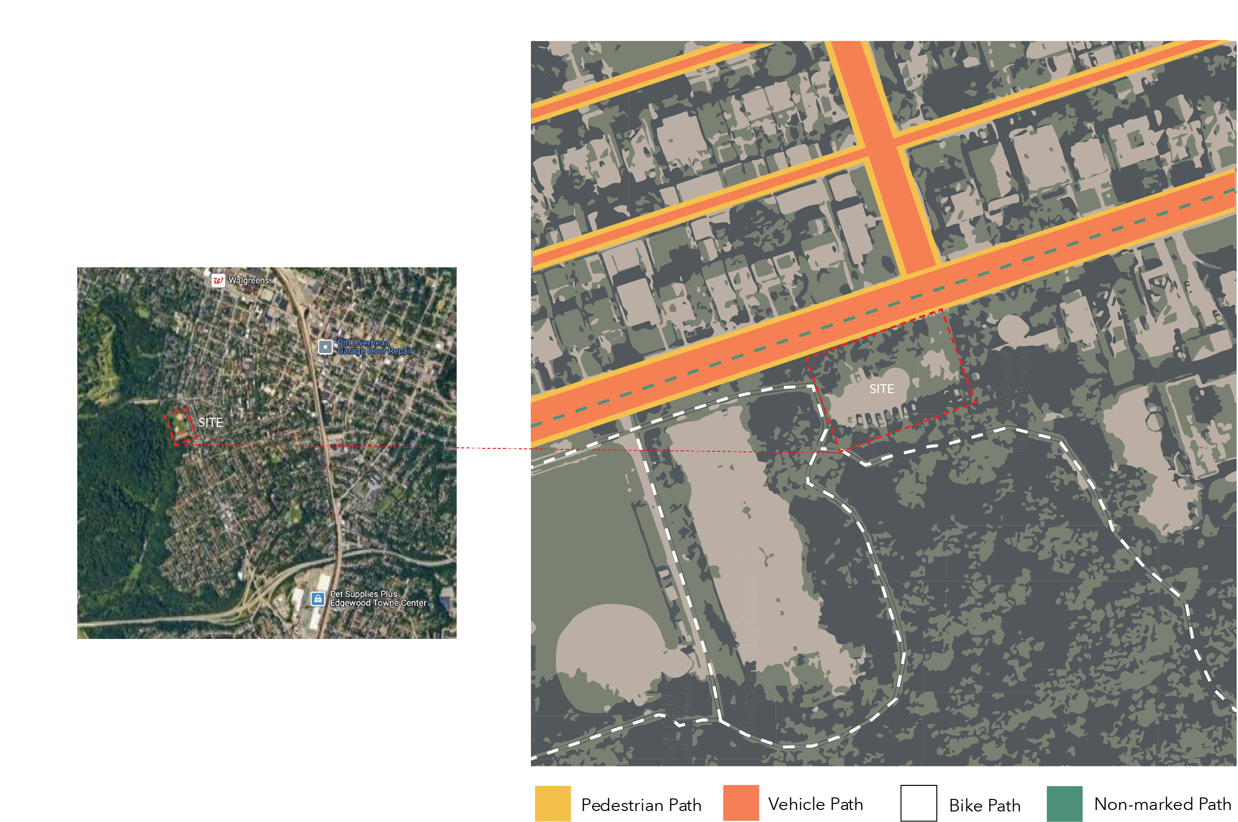
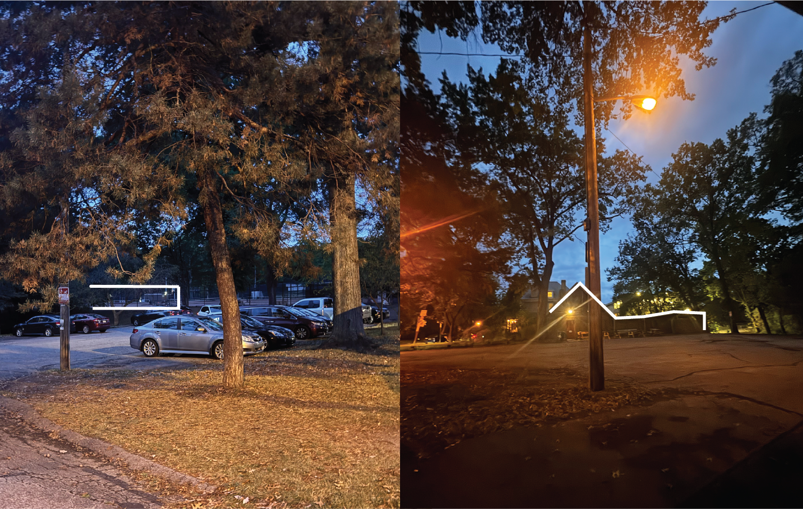
SITE ANALYSIS
BALANCE
Balance in design is not only visual or spatial but also experimental. A bike shop is meant to balance industrial elements with organic, tactile materials; nature could balance areas of activity with quiet spaces. The structure is experimental; you are meant to try and fail. Experimental design involves merging nature with structure and creating flexible, adaptable spaces that invite exploration, relaxation, and interaction. Creating a fluid balance between organic growth and architectural intervention, encouraging active participation from visitors in defining the space themselves.
 Positive v. Negative
Positive space is defined as structural beings arranged in a pattern, the void being negative space. This aids the circulation and sense of openness and flow.
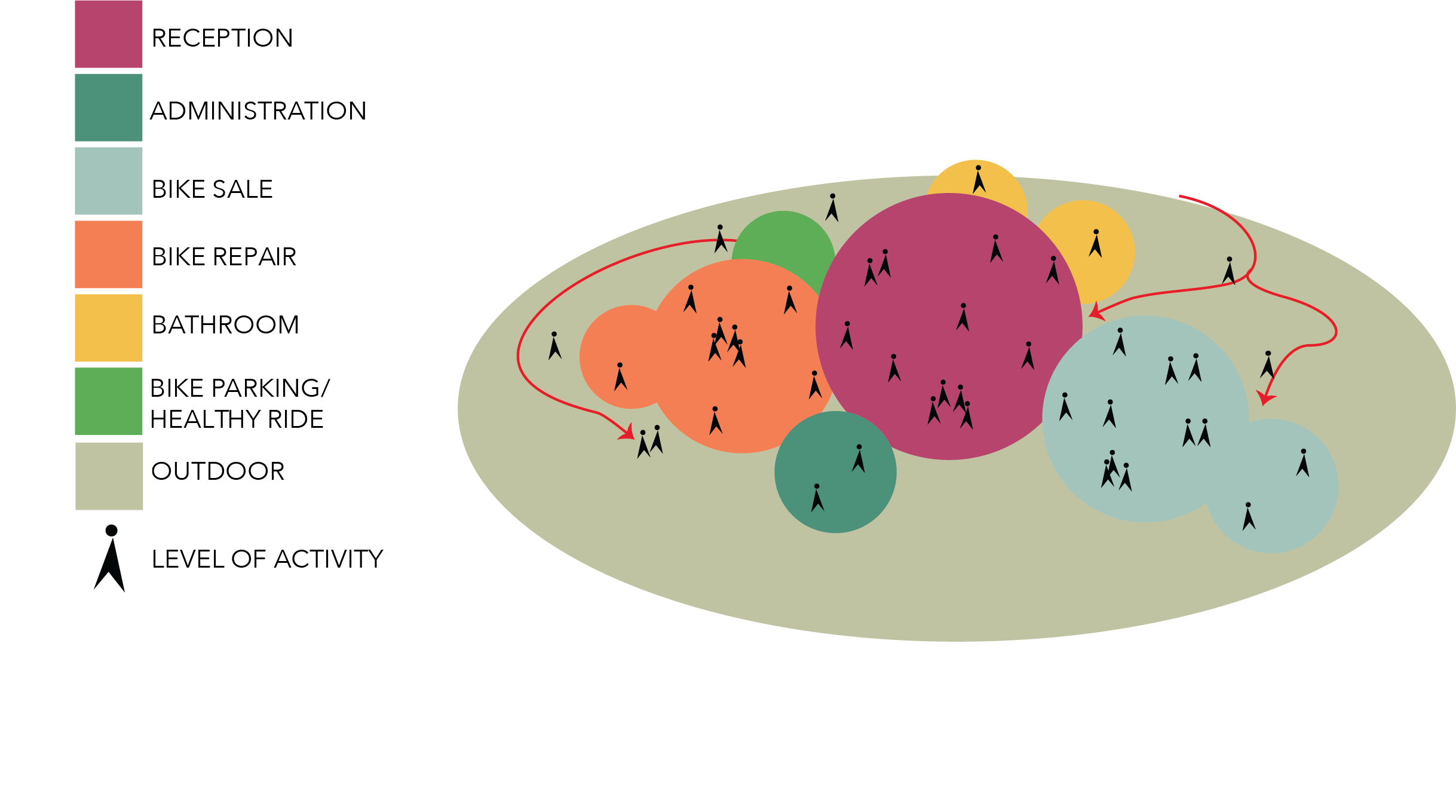
Group v. Individual
Promoting users a seamless between social and private moments, the flexibility of spaces accommodates the fluctuating number of people throughout the day.
Nature v. Structure
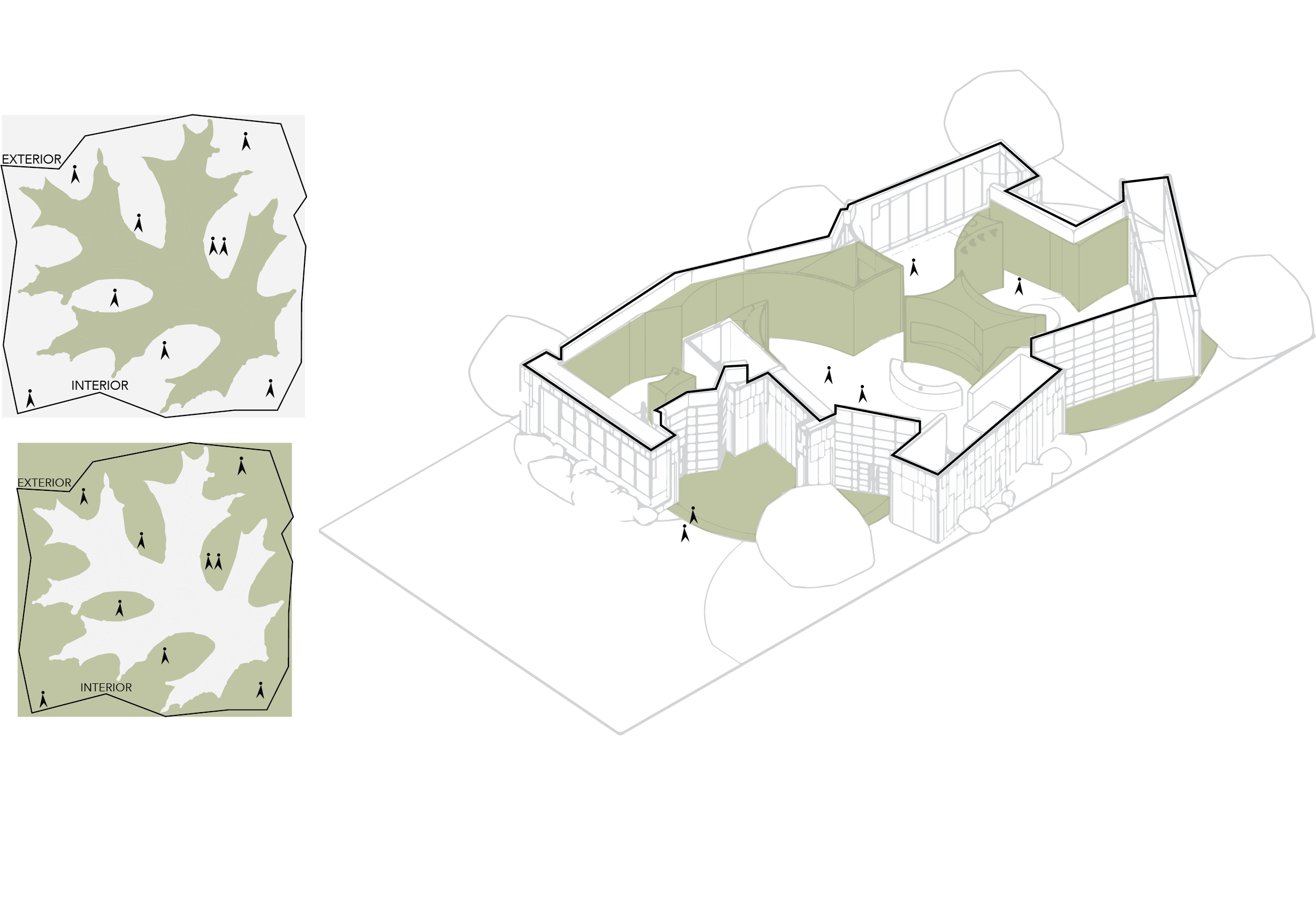
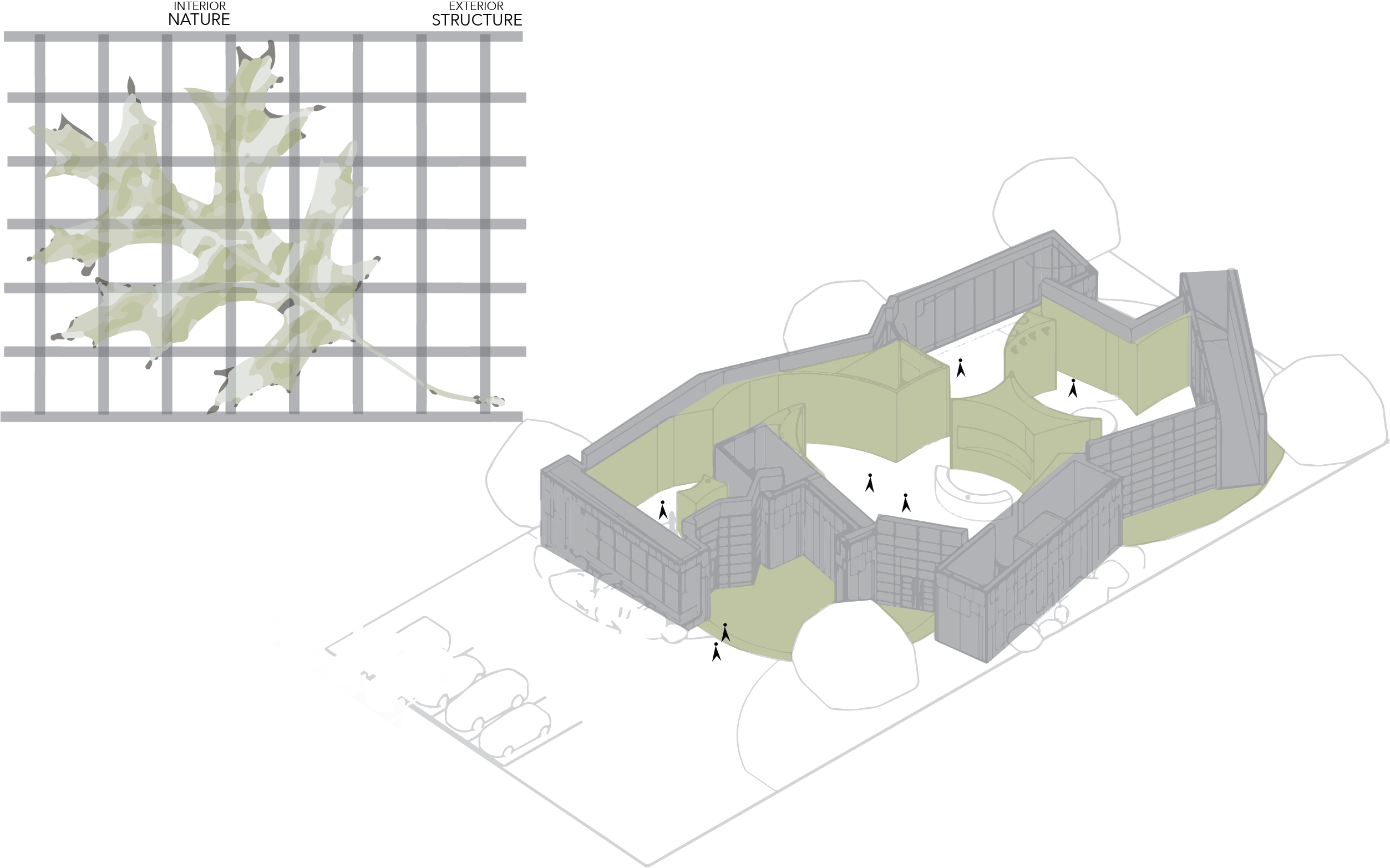
Nature itself is organic and follows fluid forms. This duality manifests by blending open, green spaces with carefully structured forms. Taking inspiration from the Northern Oak leaf around the site, it is juxtaposed with rigidity from the nearby neighborhood street grid pattern.
 Static v. Motion
Bikes are inherently about motion, designing that incorporates movements in form and function. Curved lines in the structure represent motion of bikes. Static functions slow down and make points of interest on the site for the users as repair stations.
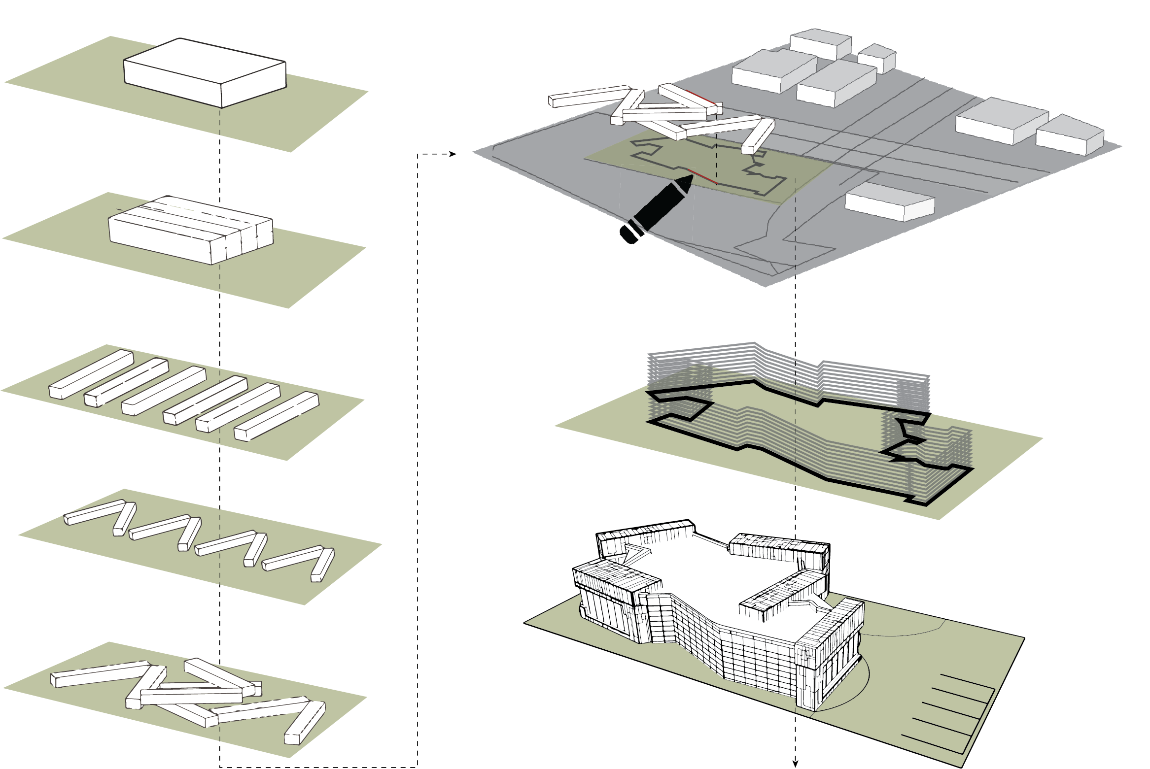
FORM
MATERIALS
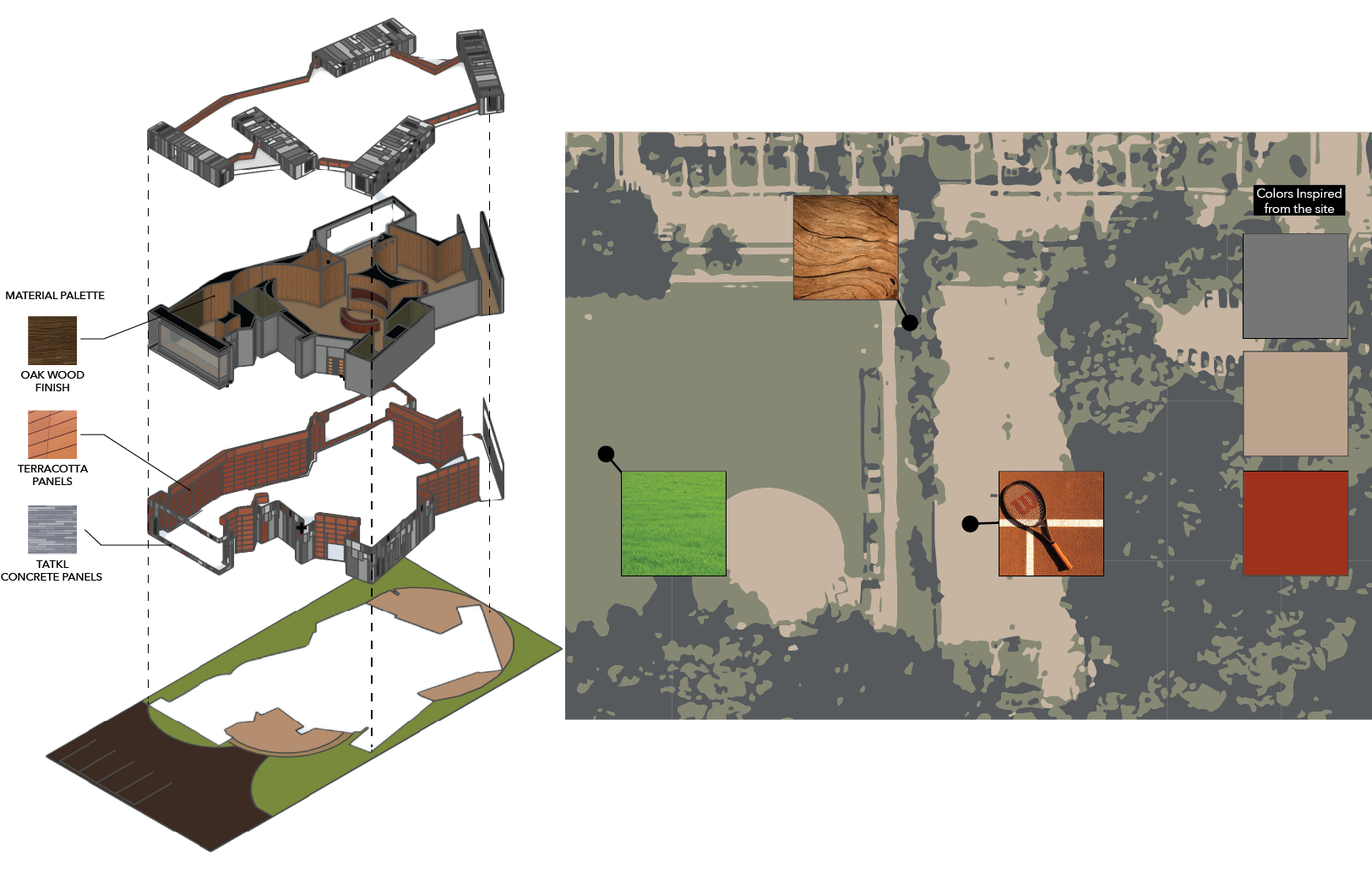 I took inspiration from the site itself, like the oakwood from the trees and the colors from the clay courts.
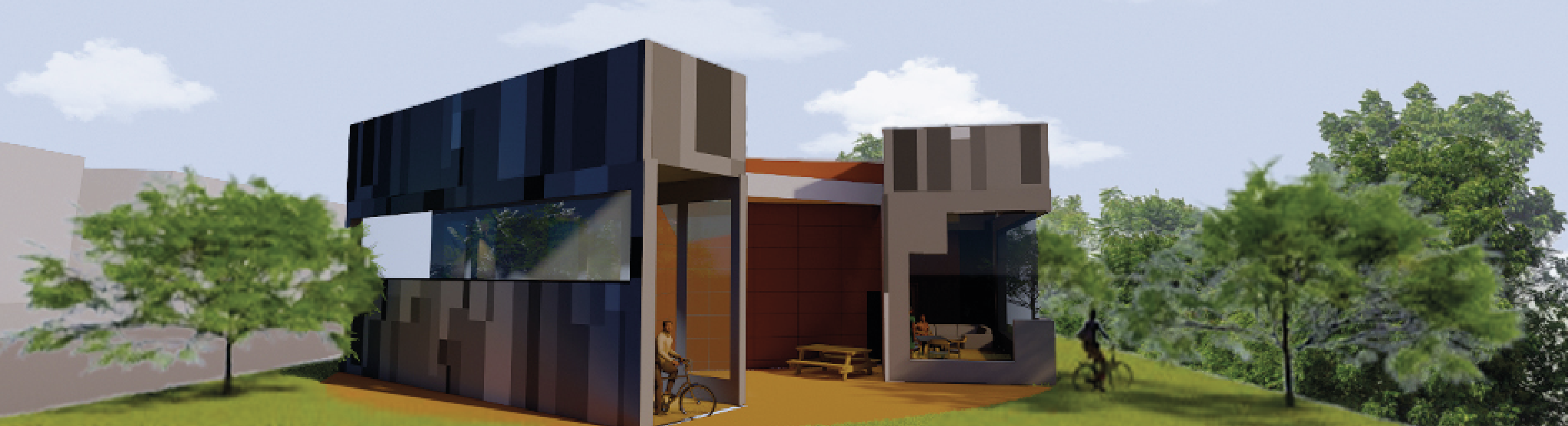
North Elevation
South Elevation
East Elevation

West Elevation
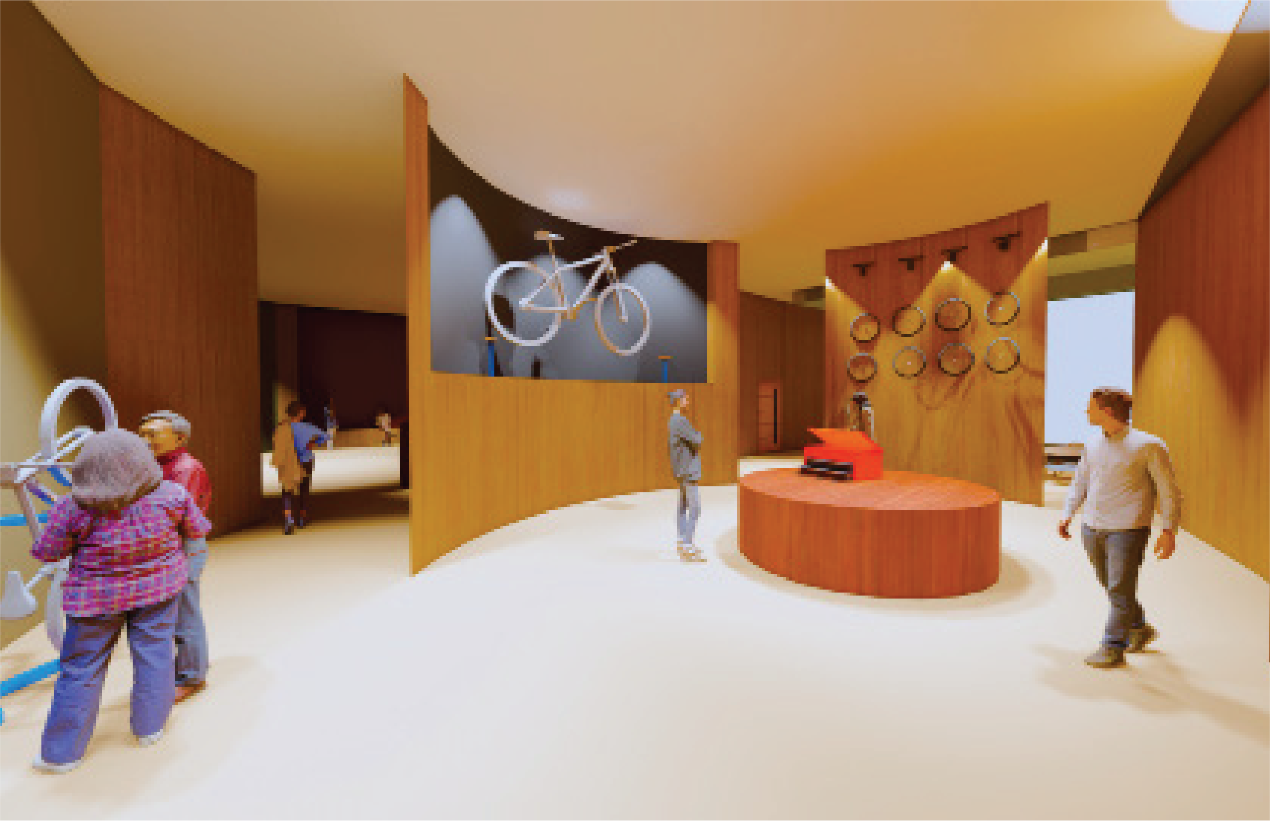
Repair Space Interior Rendering
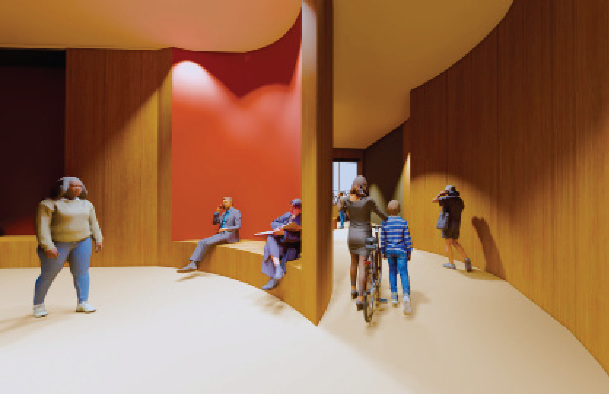
Reception Space Interior Rendering
Construction Documents
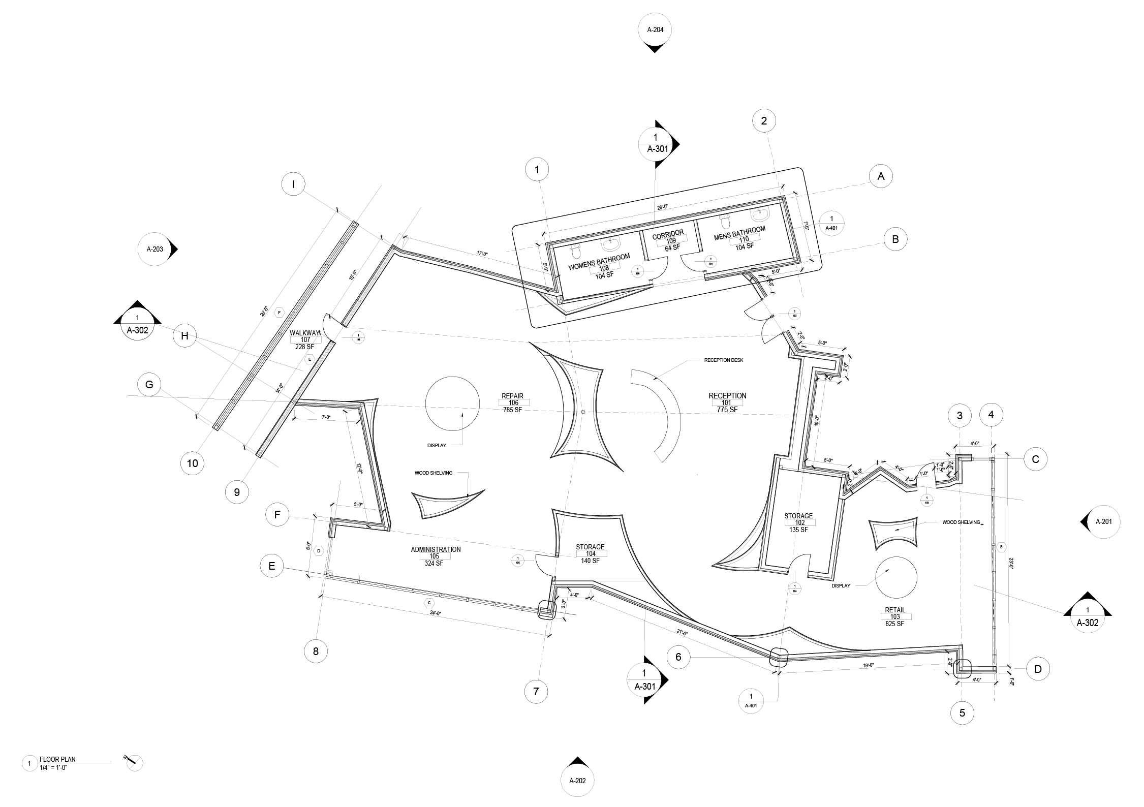
Floor Plan
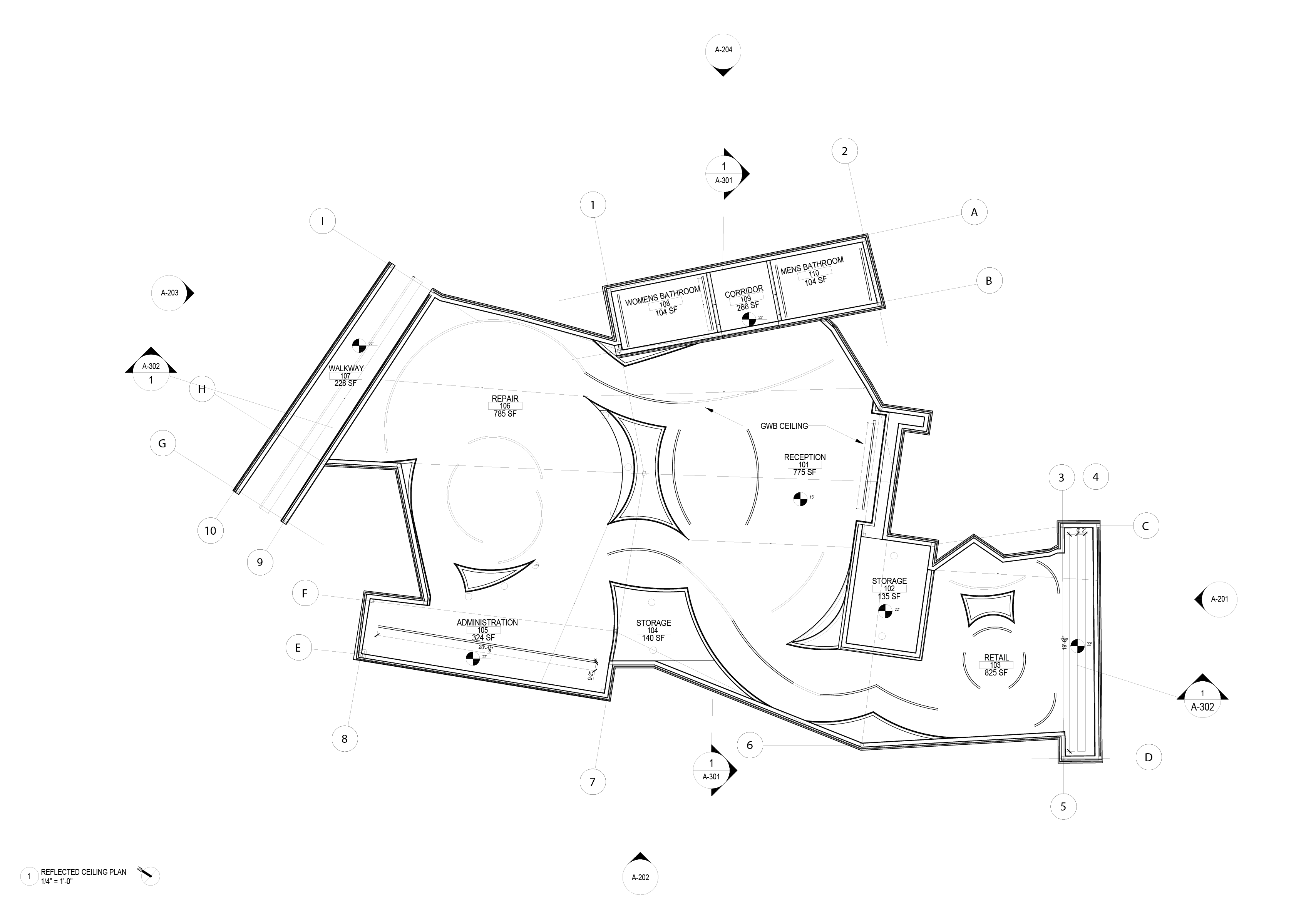
Reflected Ceiling Plan

Roof Plan

Site Plan

North and South Elevation

East and West Elevation
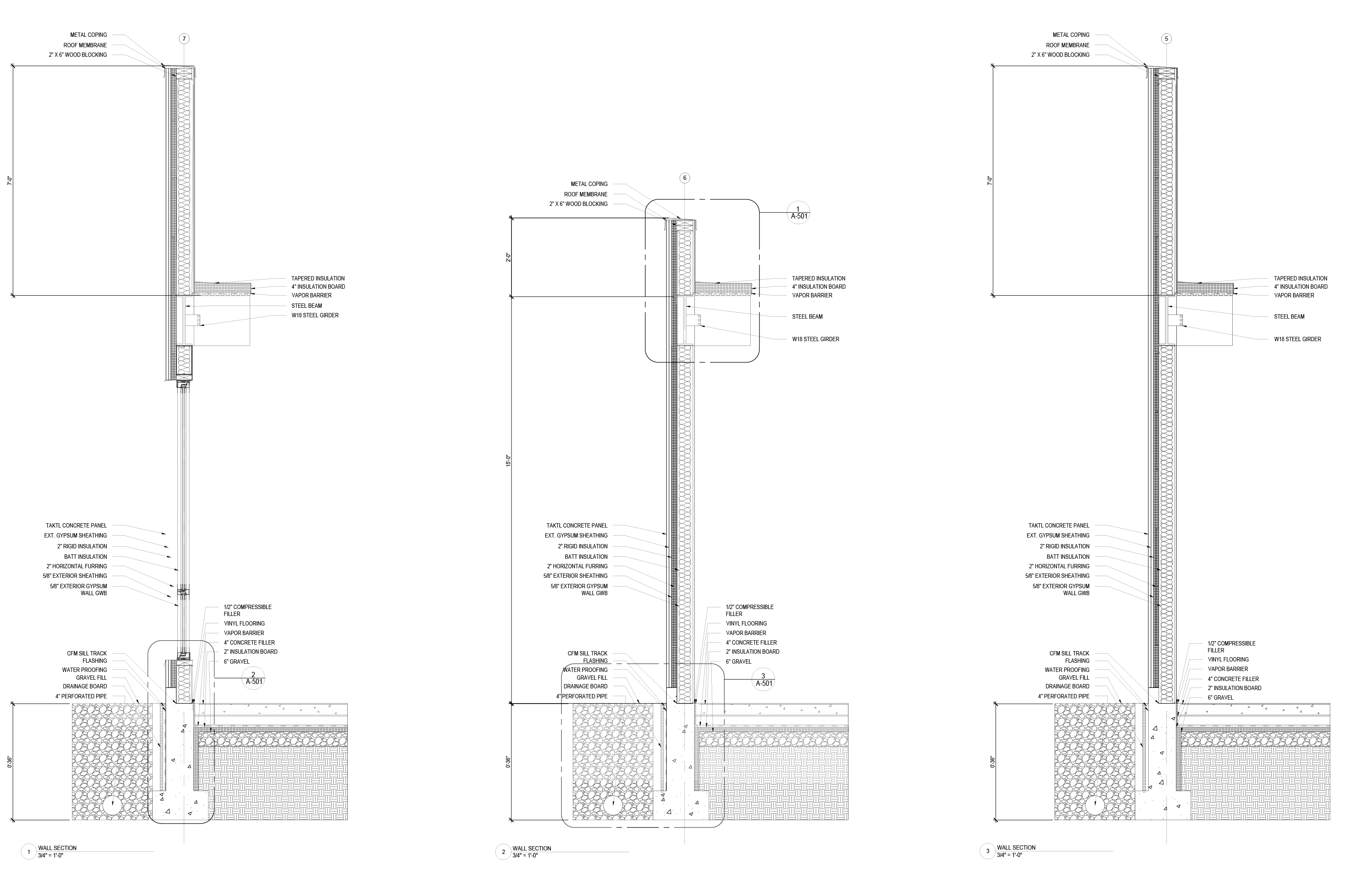
Wall Sections
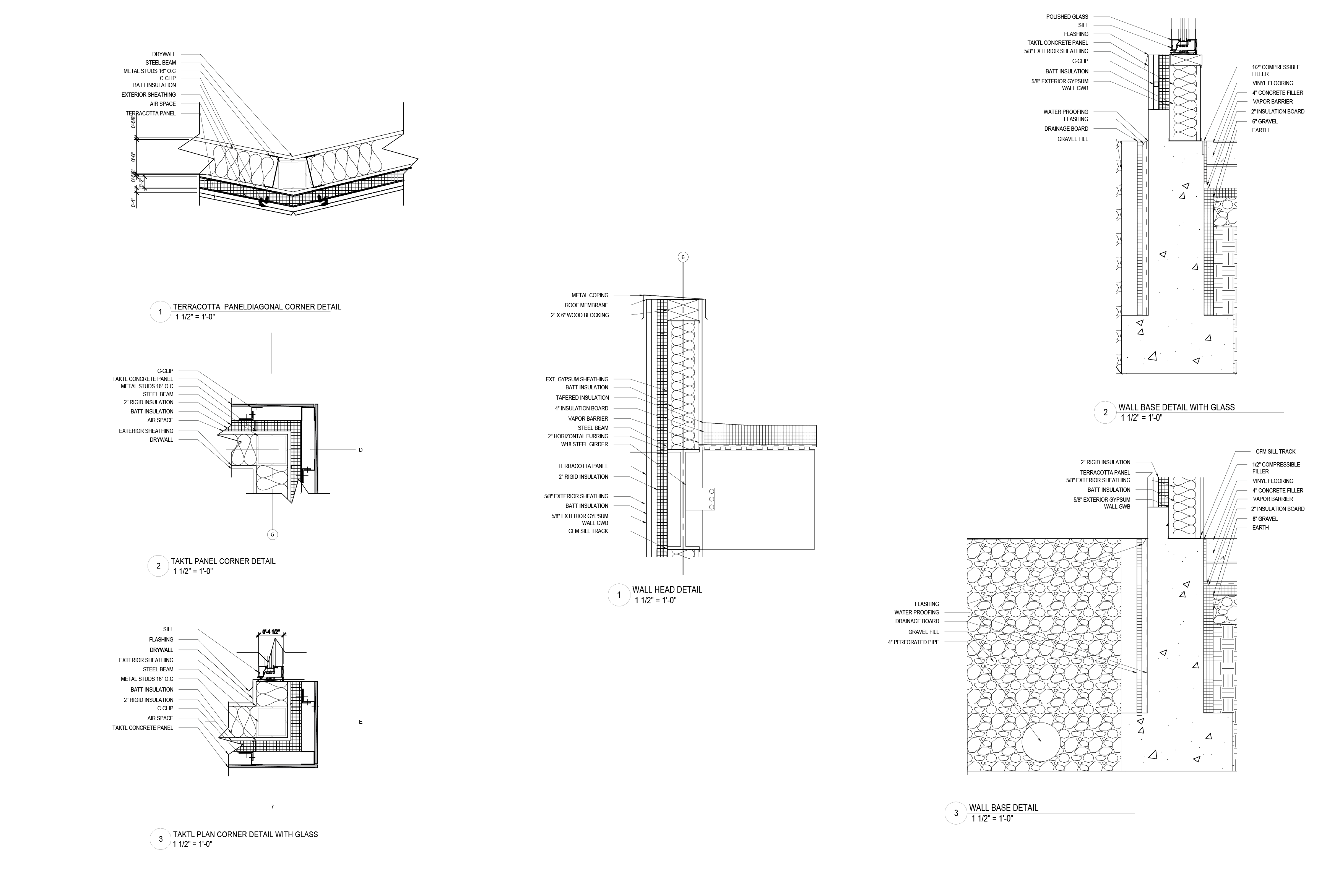
Wall Details
Sustainable Community Housing
“Interlocking Diversty”
Partner: Shaista Rahim
studio 3 | junior spring ‘24
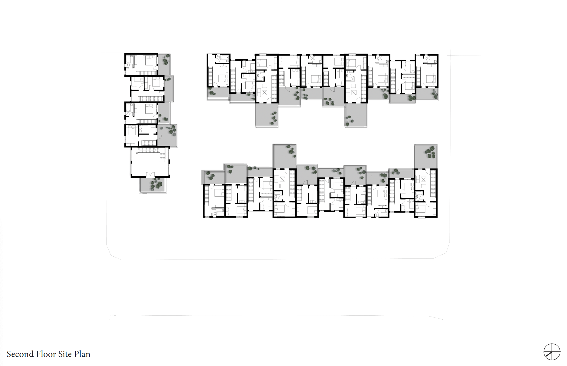
Focusing on Pittsburgh's ever-growing diverse population, we must address the limited housing available for these communities. We plan to convert an existing parking lot in the Oakland area into sustainable housing for graduate students and the immigrant population.
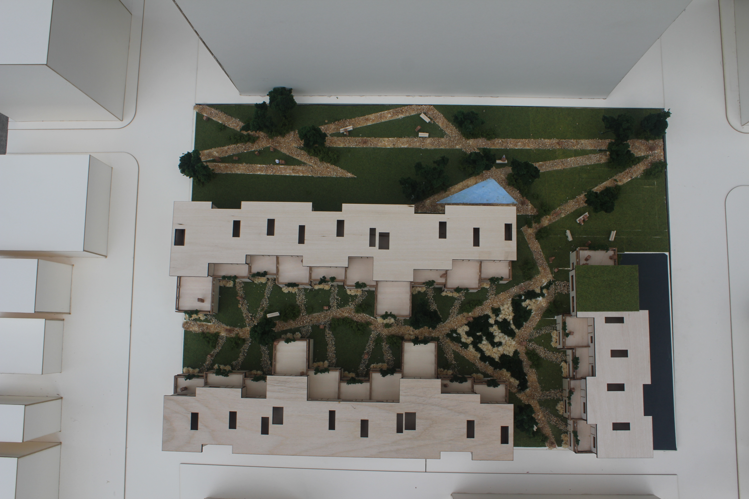 Aerial view of the site
![]()
![]()
![]()
Process

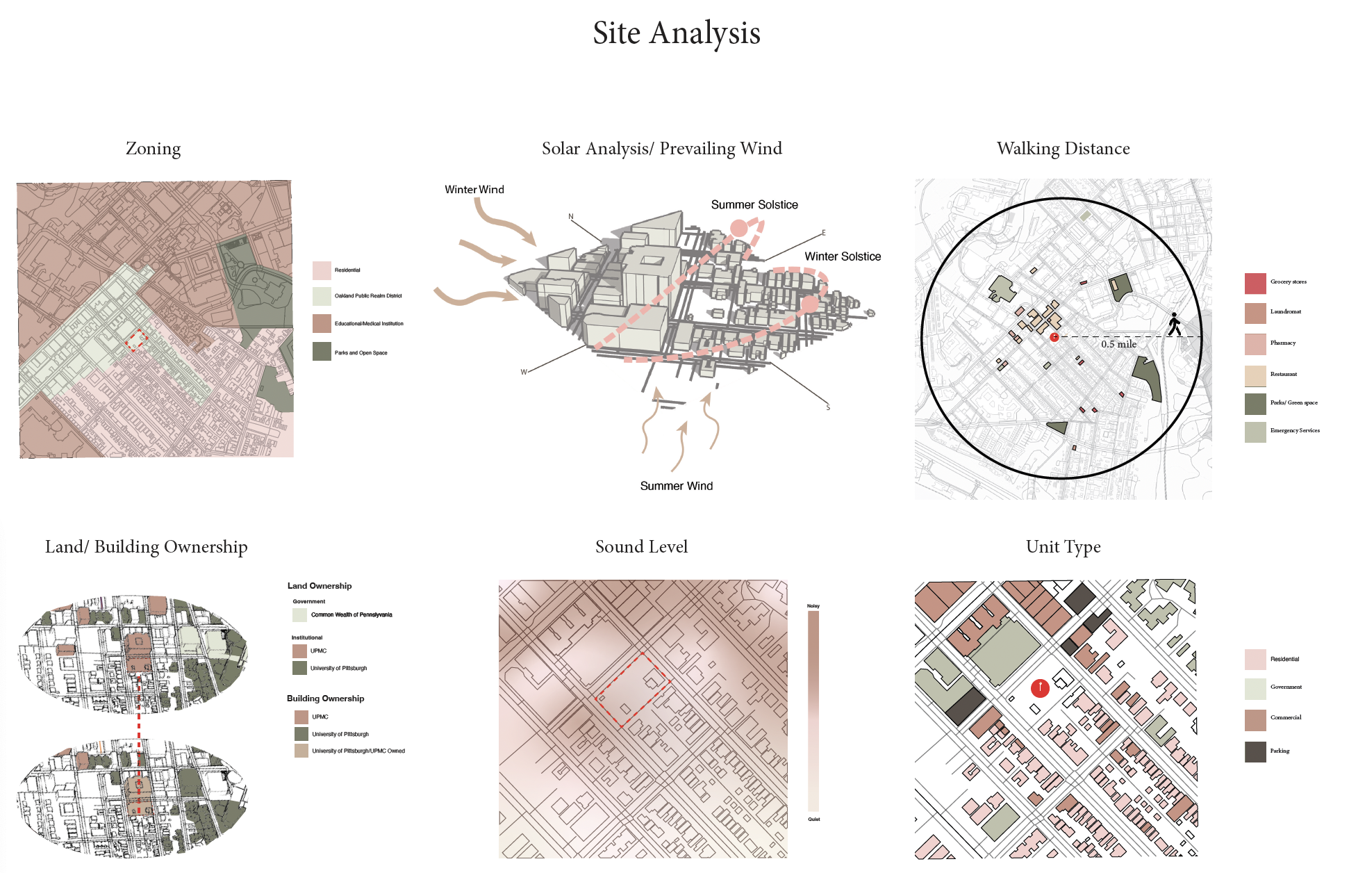 First, we investigated the land ownership near our site to determine the needs, such as green space and the types of buildings trying to fulfill a need that is missing in the area. Therefore, in our final design, we wanted a big green space for the Oakland community.
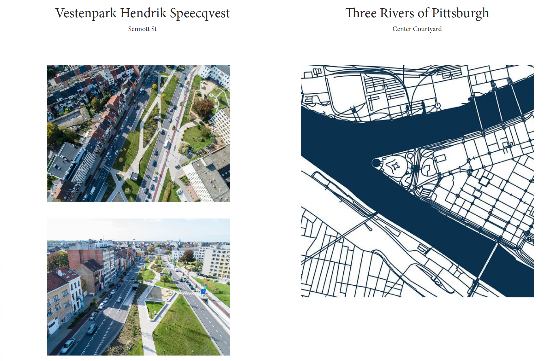
The goal of our site is to foster a community of people from various walks of life. Pittsburgh, known for its three rivers that converge downtown and in the Oakland area, is where these communities have chosen to settle. The rivers meet at "The Point" downtown, each flowing toward a common destination. Similarly, our site attracts and brings together people from different backgrounds to Sennott.

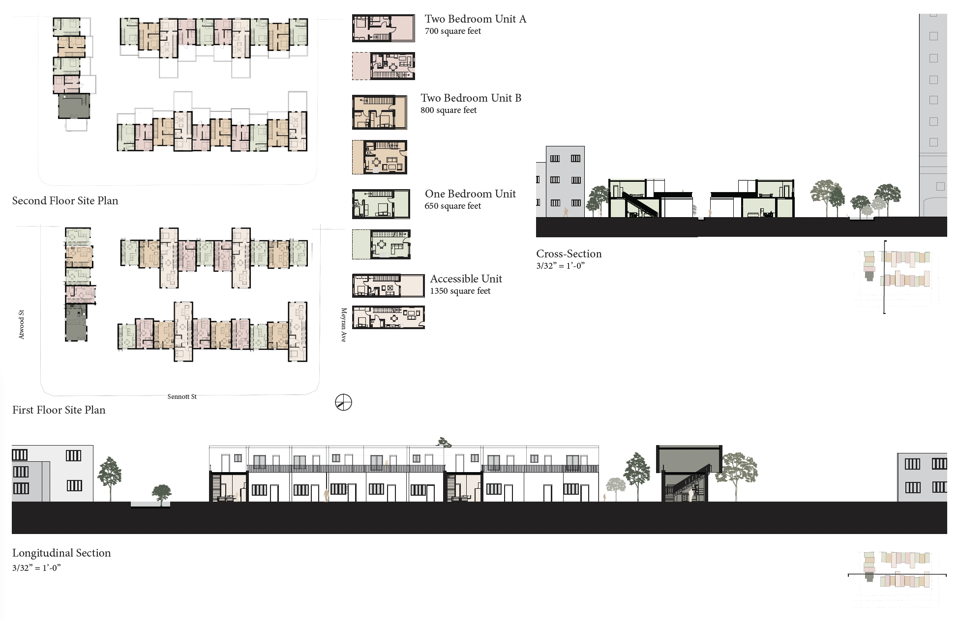
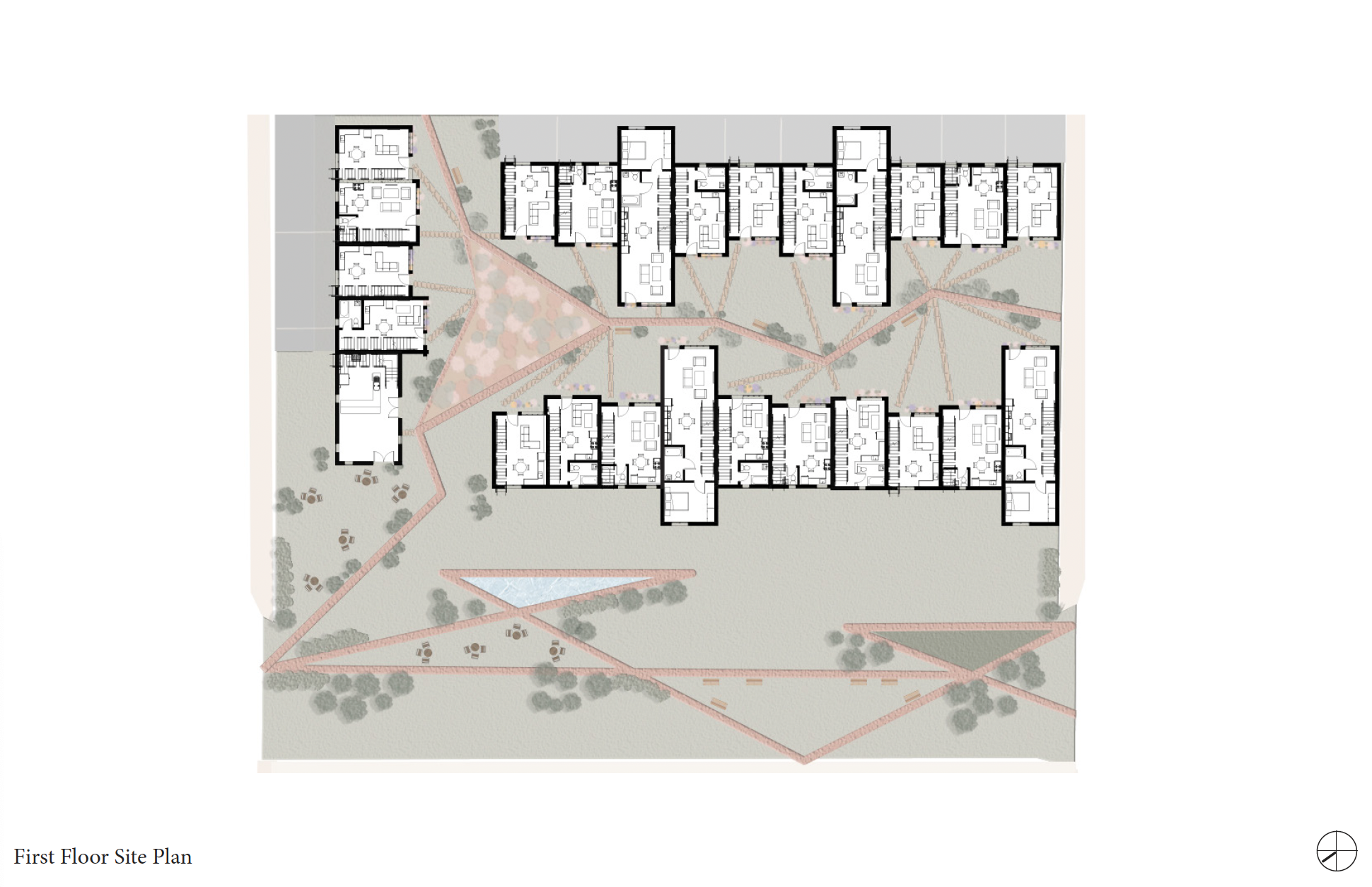
Floor Plans
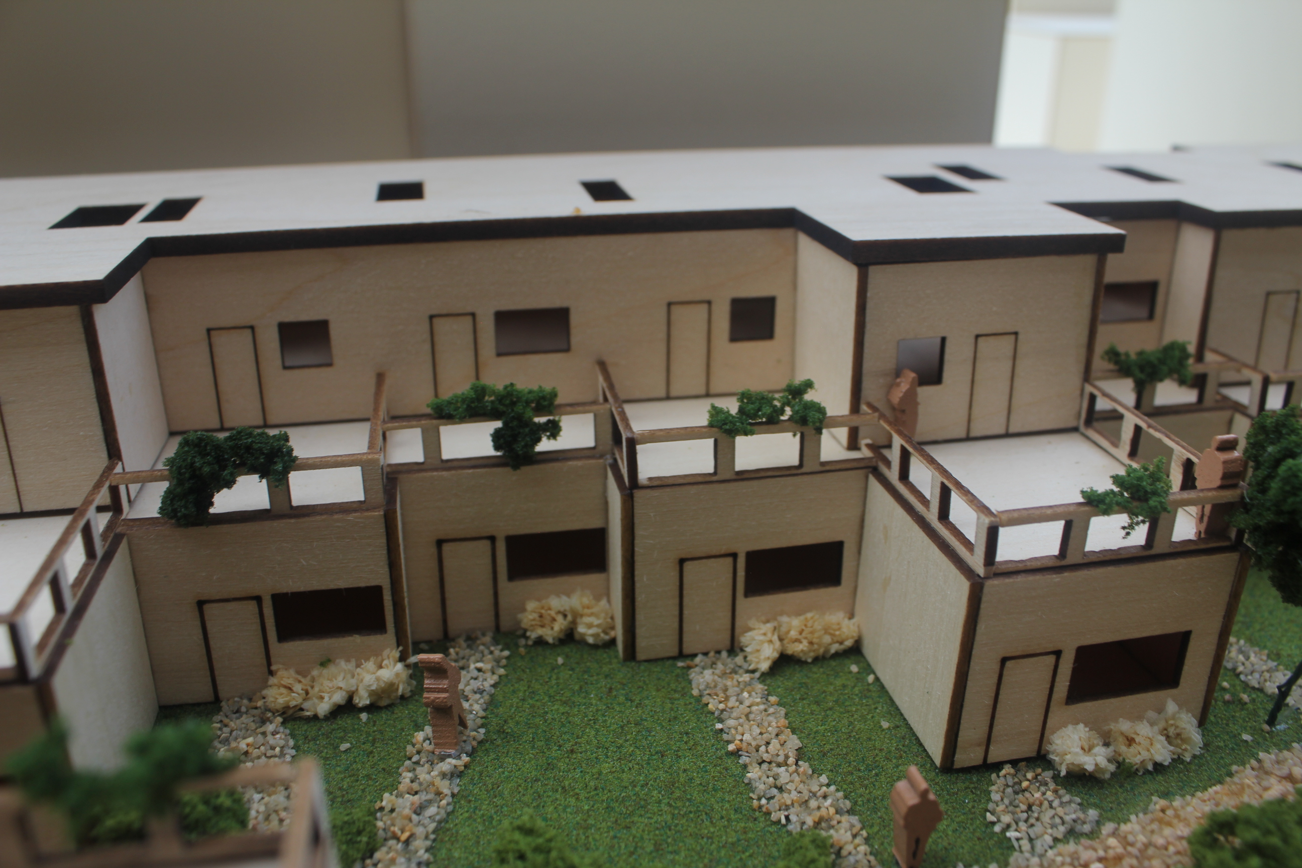
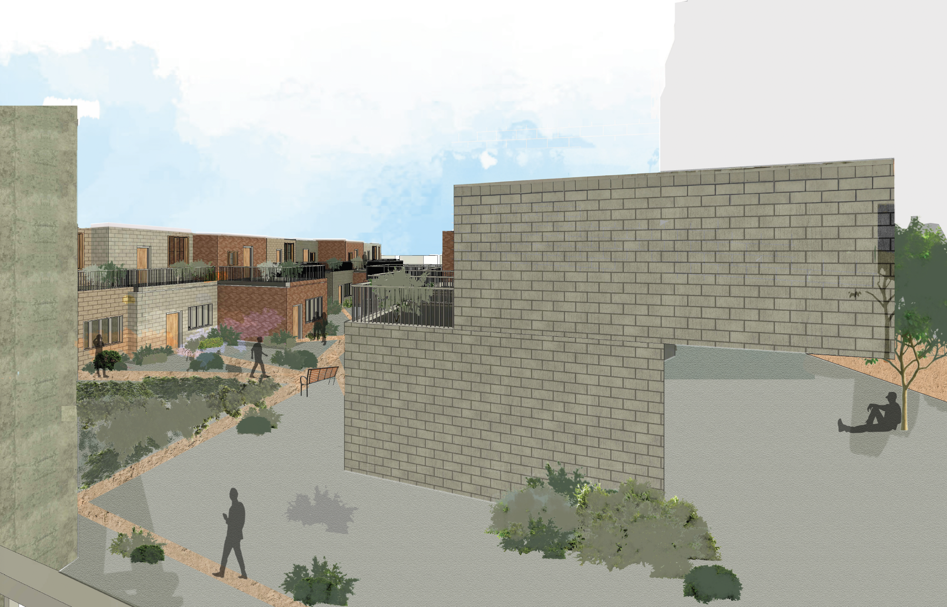
With intentional landscaping, we create spaces that encourage interaction among neighbors and the community. The apartment units themselves are unique to each resident. Each unit is a two-story home that offers a sense of individuality, with each façade designed to be distinct from the neighboring one. The pathways weave through the site, zigzagging and intersecting, ultimately leading people to a shared destination.

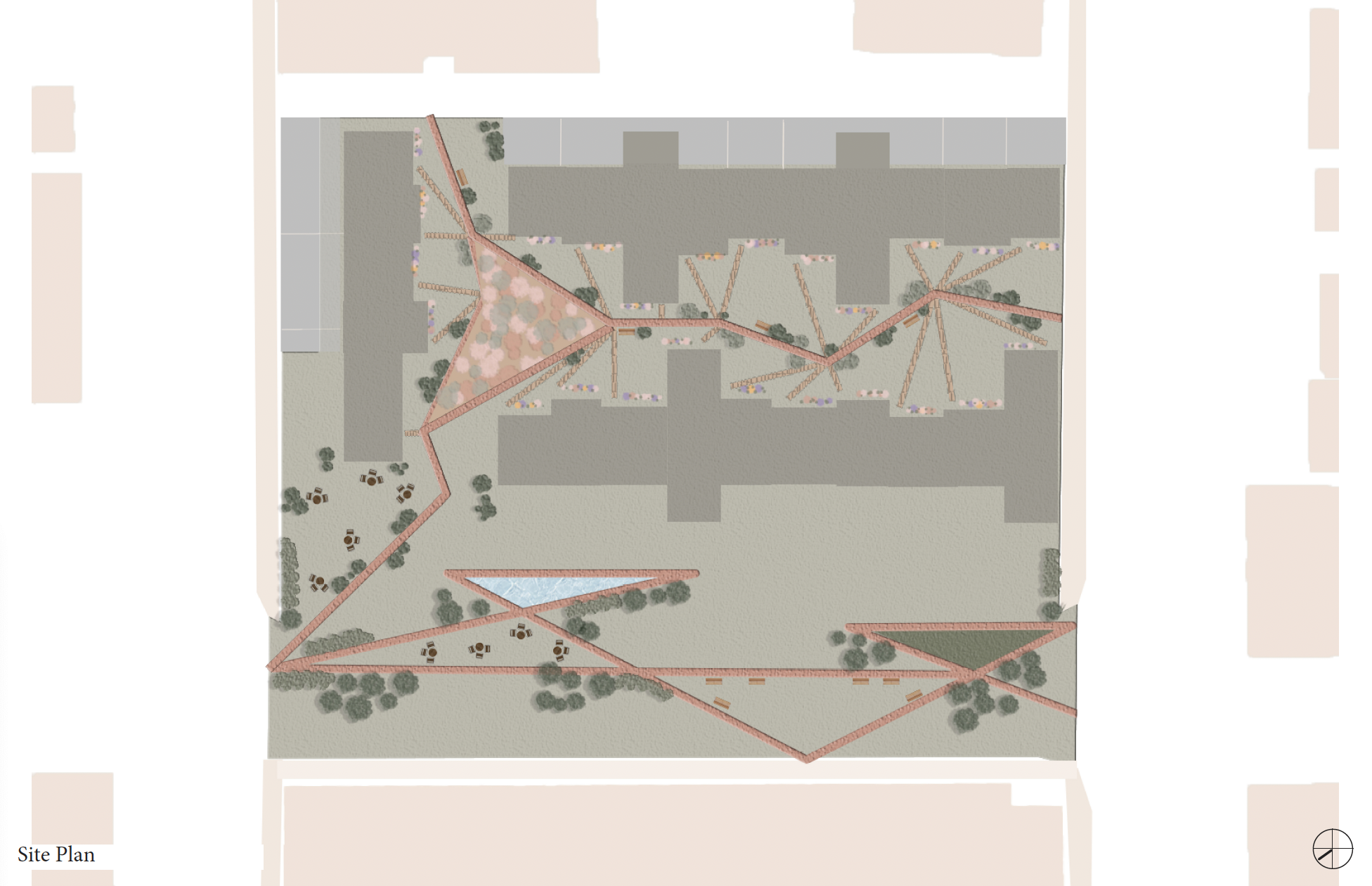
A Museum of ____
“Museum of Unearthing”
studio 2 | junior fall ‘23
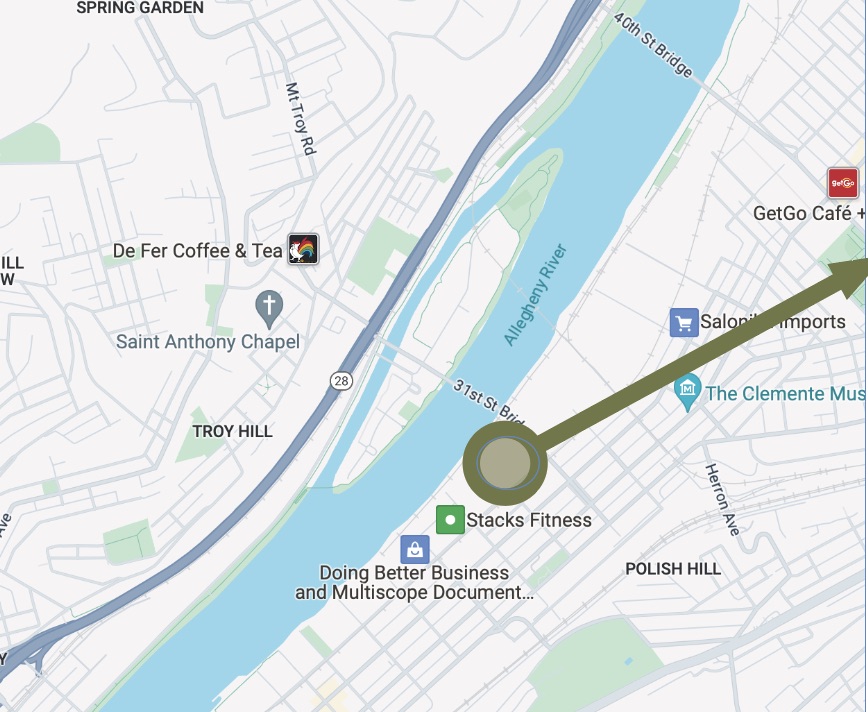
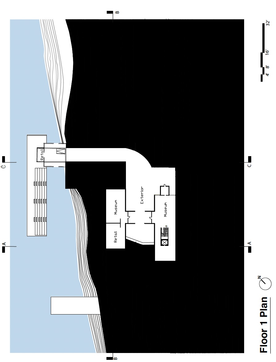
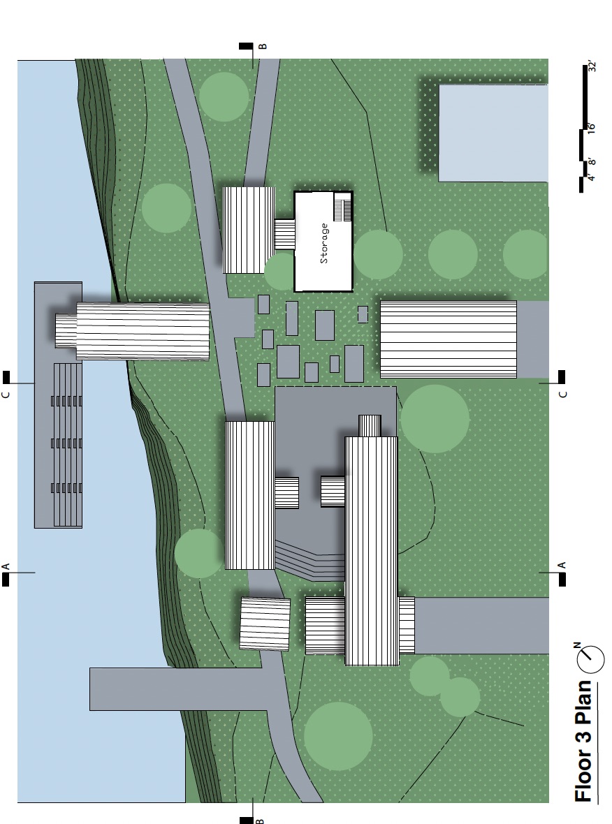
Located at the intersection of the Allegheny, Monongahela, and Susquehanna Rivers. Pittsburgh’s location and history were a catalyst of the rapid expansion and industrialization of steel, glass, and coal. Calling for skilled workers to mass-produce these materials within the city from the late-19th to mid-20th centuries. This Museum uncovers these industries in a comprehensive museum space.
 Aerial View of the site
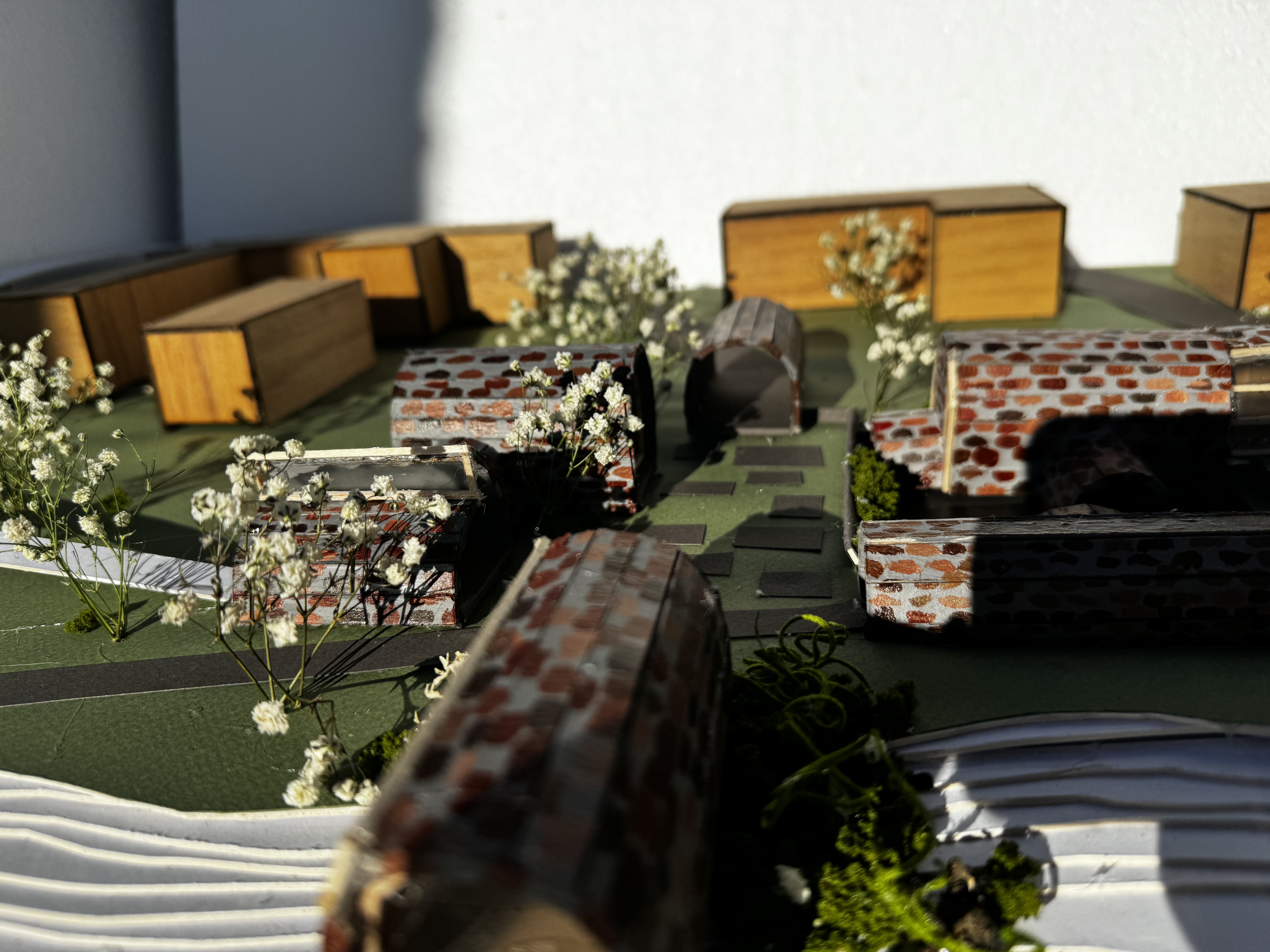
Process
The site sits in the strip district in Pittsburgh, PA, more specifically, sits between the 31st Street Bridge and Railroad St. Currently sitting on the site is Pittsburgh Public Works, a sanitation facility. Working with a Pittsburgh company Riverlife and tasked to rework their proposal of what will sit on the site. The theme of the project was “Museum of ___” and the museum will consist of commercial development, outdoor recreation facilities, pedestrian access from the bridge, a public park, and a dock.

Riverlife’s proposal for the site
Diagrams
Tasked to craft a narrative for our site and sticking to that narrative, I chose the word meandering to base my design. Taking inspiration of Pittsburgh’s infrastructure, focusing on the Fort Pitt Tunnel. Capturing the experience of exiting the tunnel and experiencing the release of the exit and being in awe of the sight of downtown Pittsburgh’s skyline. Replicating that experience of the exit on my site. The word meandering, allowed the museum visitors to have their own autonomy walking around my site. Therefore, layering allows for more exploration, rather than having all buildings on one plane. Different buildings and the arrangement on my site is meant to replicate the exit of the Pitt Tunnel.
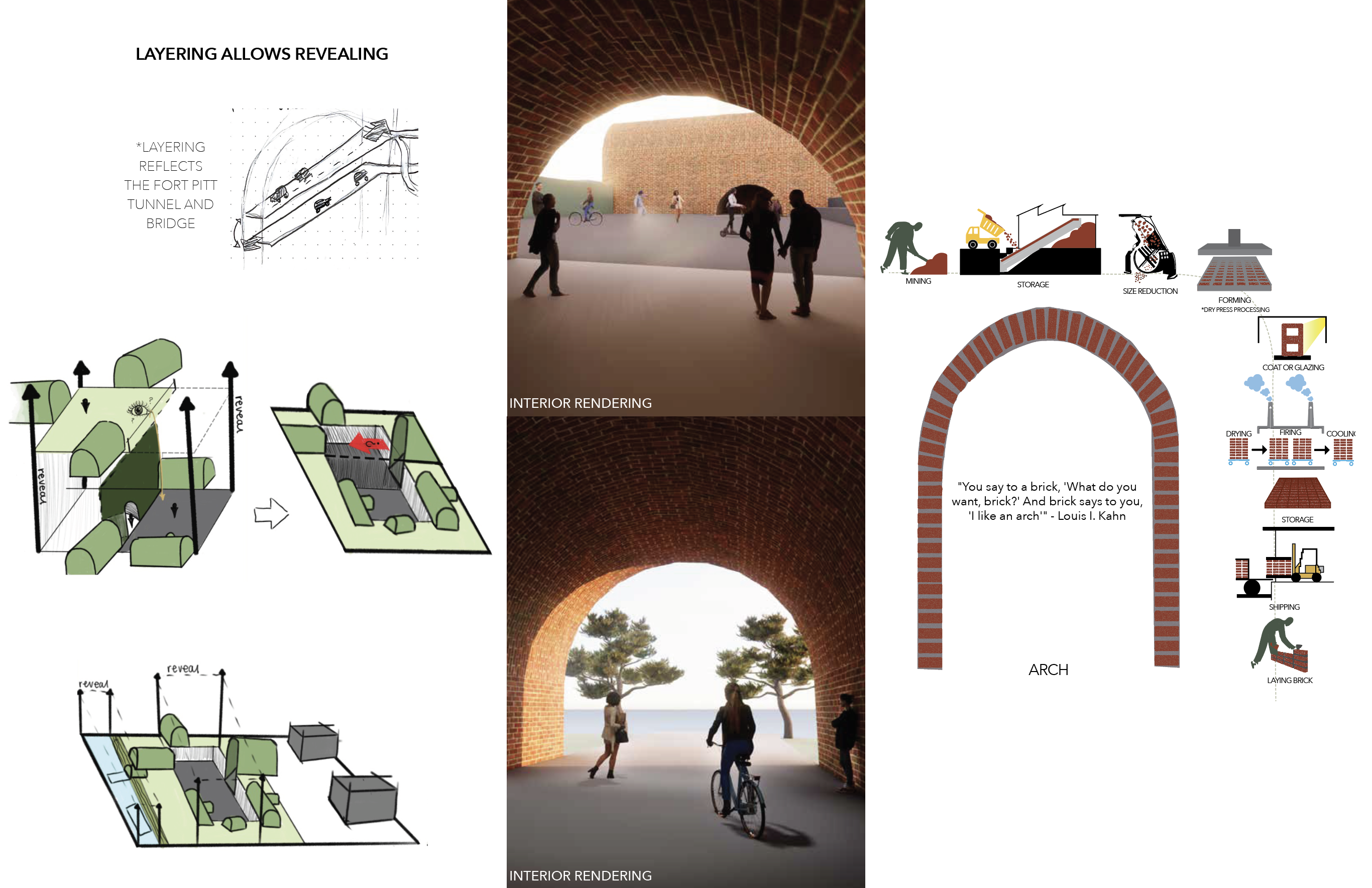 Brick plays a central role in shaping the materiality of my building, driven by its "urge" to form an arch. This diagram emphasizes the humanization of the brick-making process. Highlighting the importance between it crafted origin and its aspirations. Focusing on the transformation from raw material to a structural and expressive element, the diagram celebrates the process as a product of human invention and architectural ambition.
Floor Plans


Accessible Community Space
“Geometric Grove”
studio 1 | sophomore spring ‘23
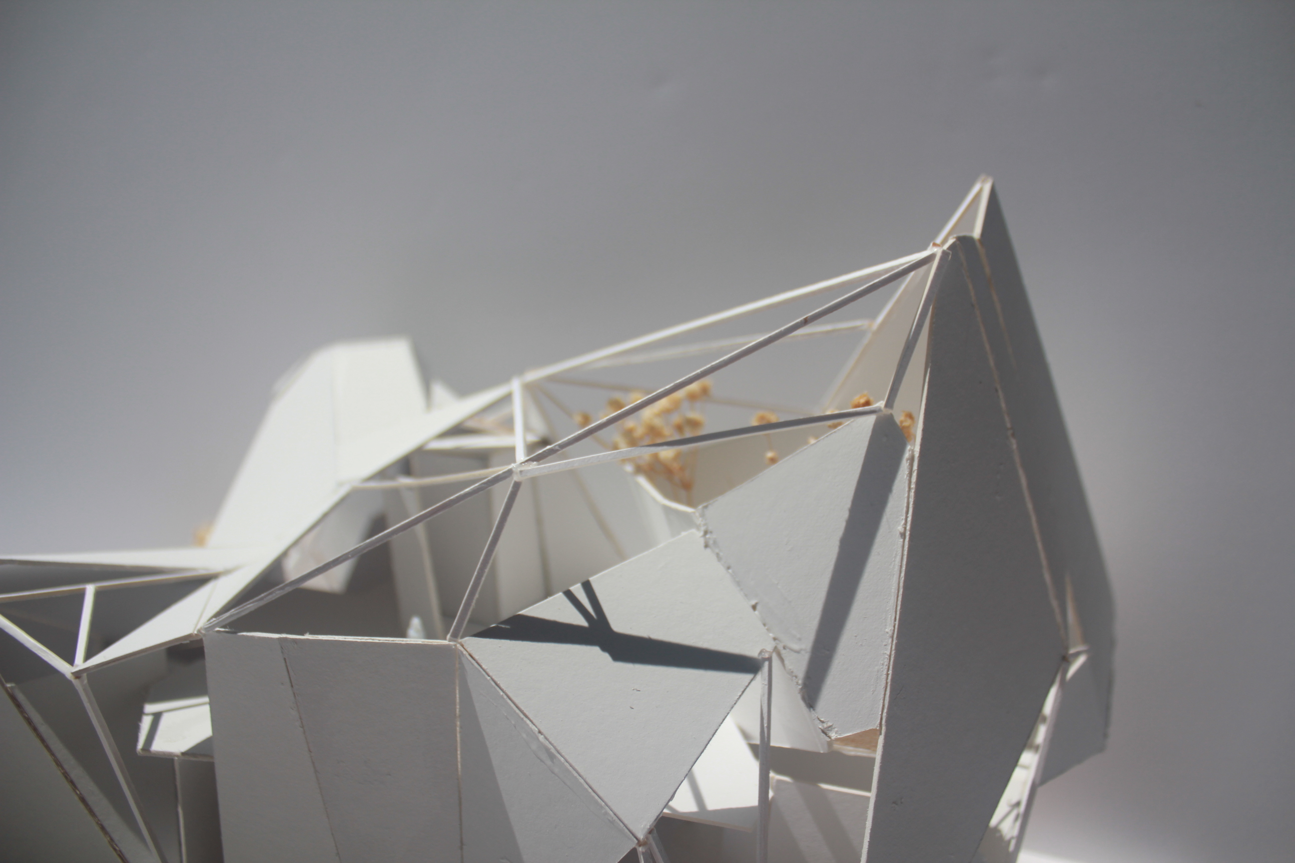
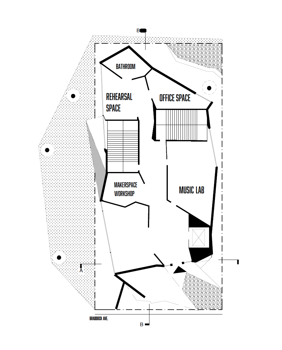
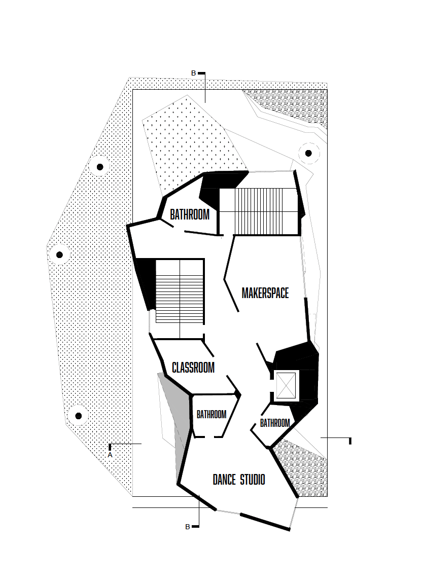
This studio focused on the Braddock area in Pittsburgh, Pennsylvania, more specifically the Braddock Avenue corridor between 6th Street and 11th Street. Conducting research in nearby Pittsburgh neighborhoods in comparison to Braddock. Using the process of forced lines, and geometric cracking to result in a series of lines, and folding along the lines to create a building.
 Aerial view of site
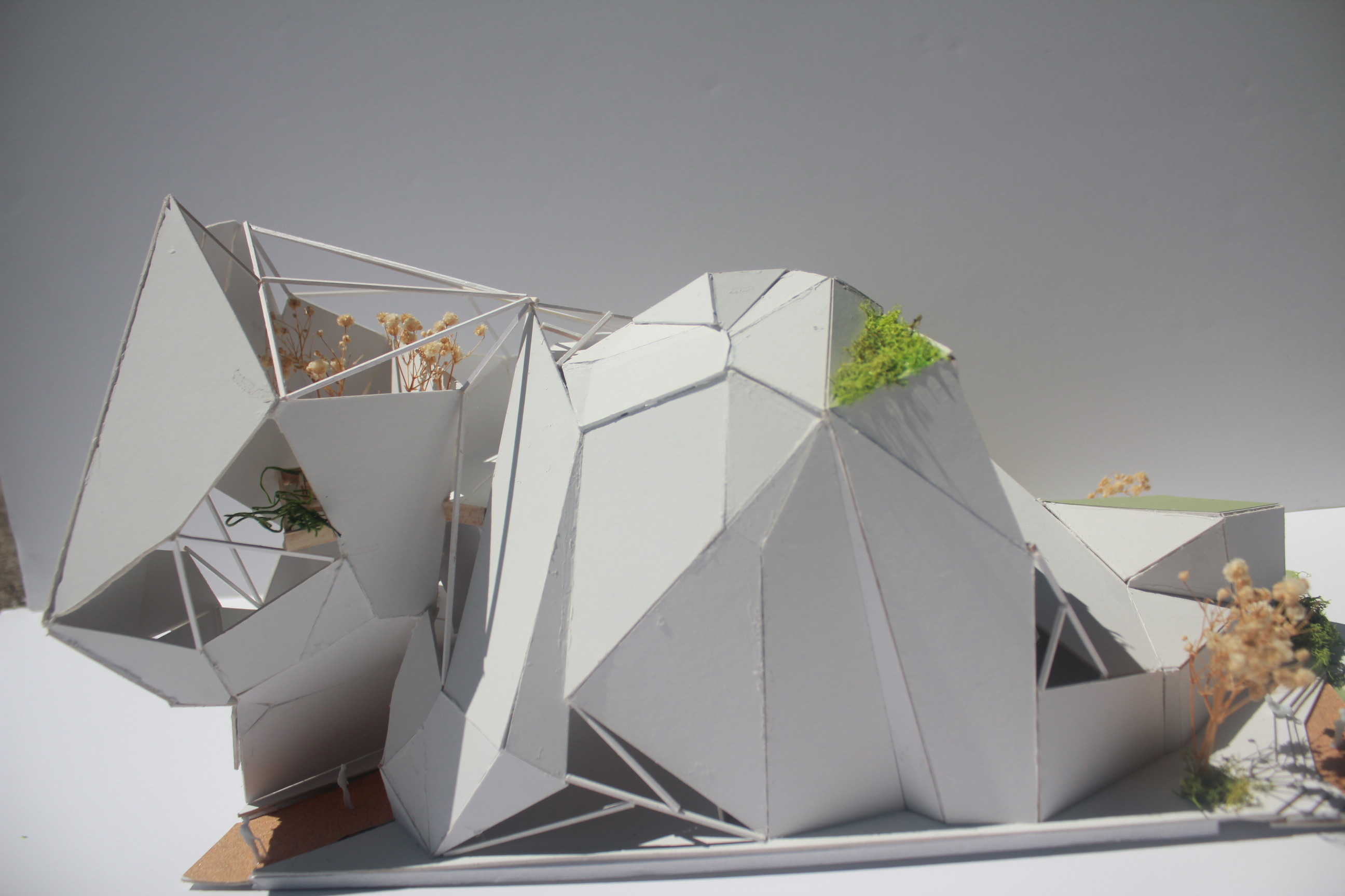 West view of site
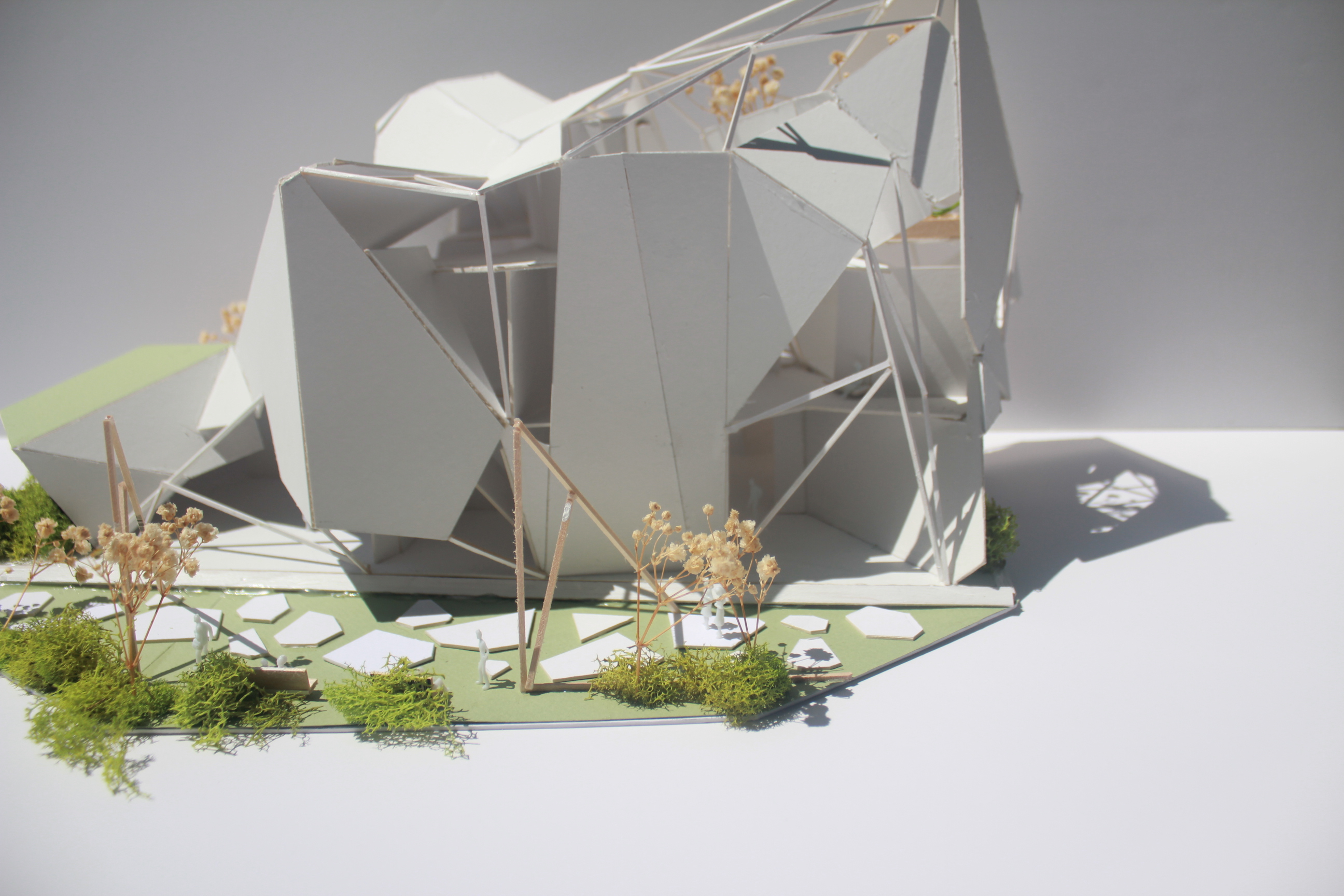 East view of site
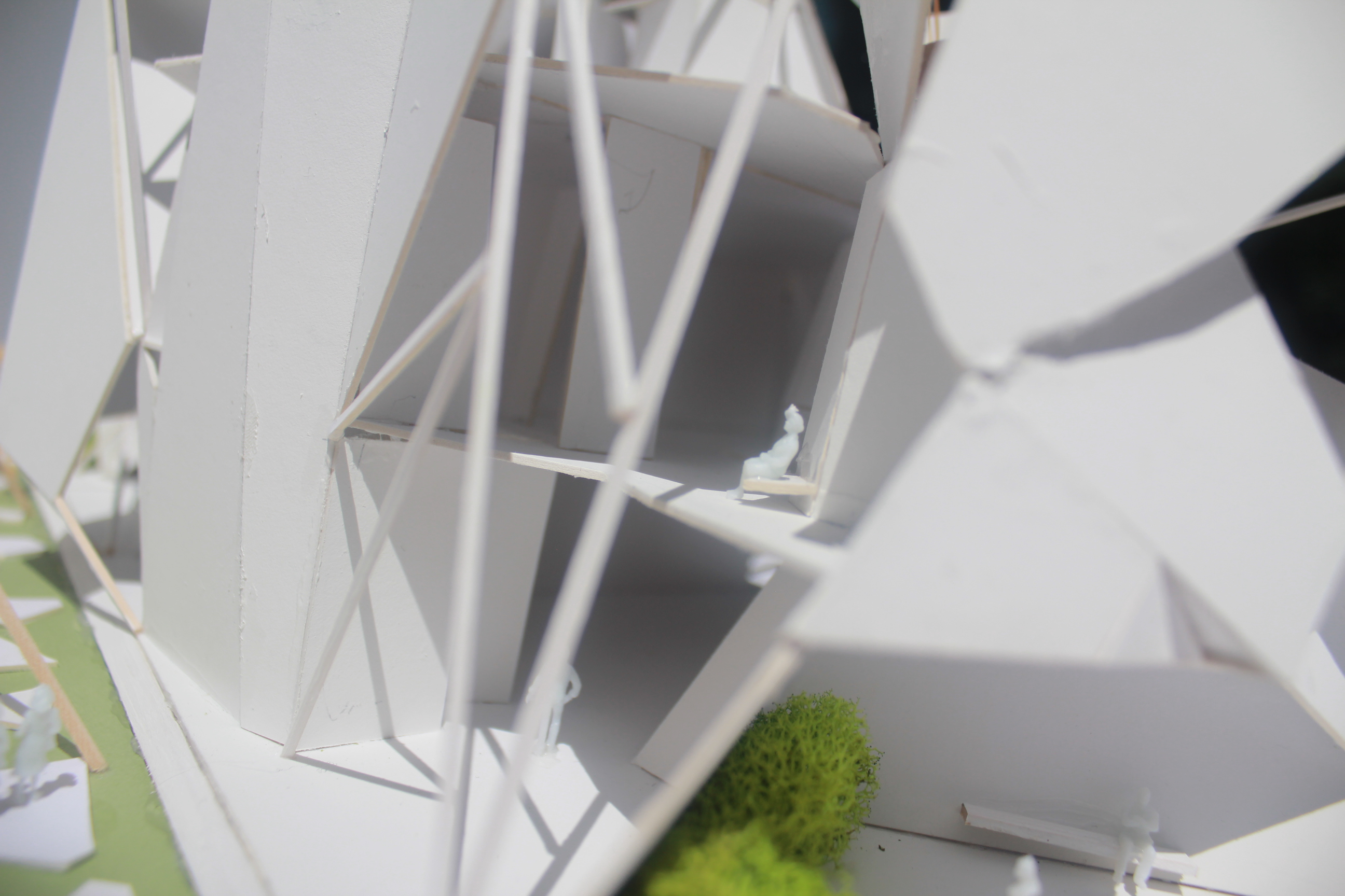
Process
Utilizing the folding of paper, I analyzed key points surrounding the site and applied methods of geometric cracking and forced lines to create a web of lines. These lines were then printed to paper and used to fold and create a “skin” for various components housed within the building. I was tasked specifically with examining traffic patterns in Braddock, researching popular locations, and categorizing them based on their peak activity times and uses. These points were then processed through Rhino and the aforementioned methods were applied.

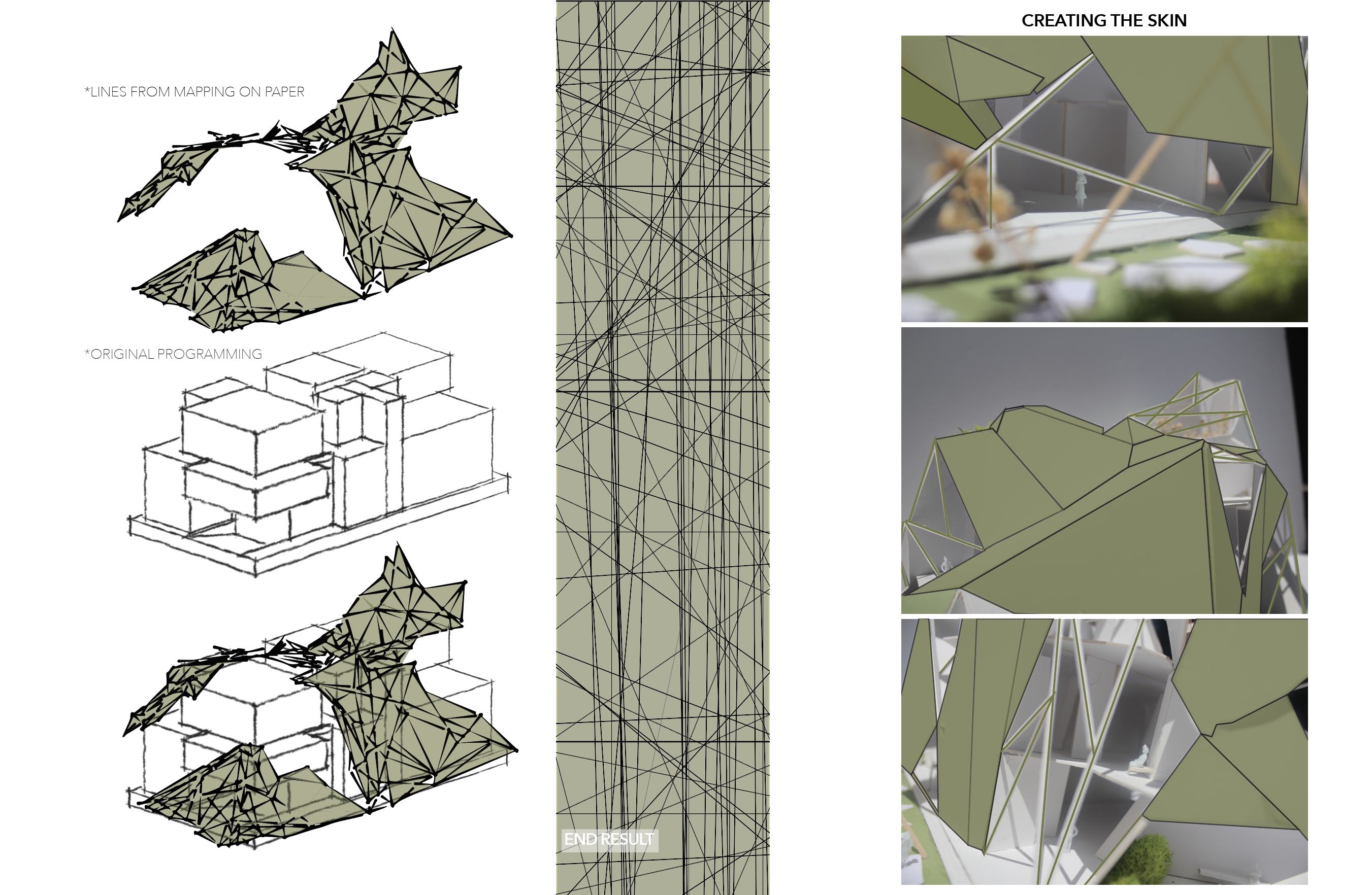
This is the final lines I had used to fold along and create a “skin” for my building.
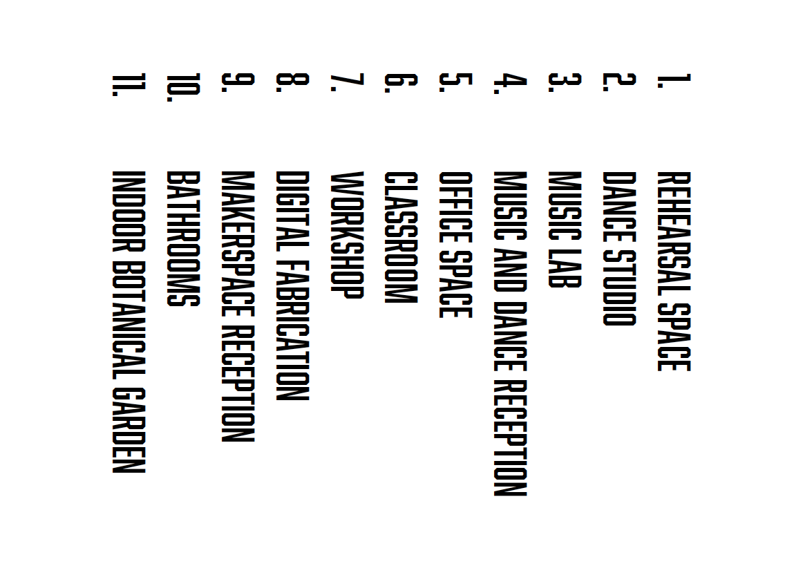
FLOOR PLANS AND SECTIONS


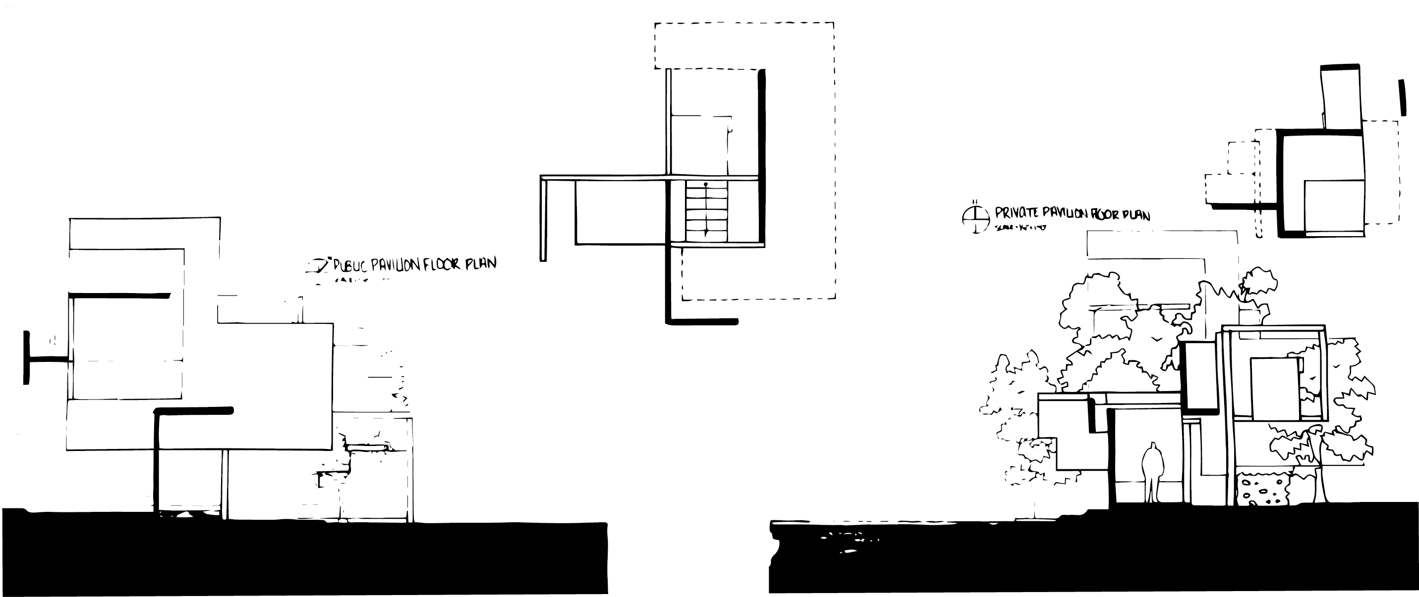
PRIVATE VERSUS PUBLIC
foundation studio | sophomore fall ‘22
Foundation studios focused on learning the distinction between public versus private spaces. This studio also taught hand-drafting site plans, floor plans, and section cuts. Placed in a river in Ohiopyle, Pennsylvania, and assigned to build a boat dock to respond to the river.

Aerial view of site
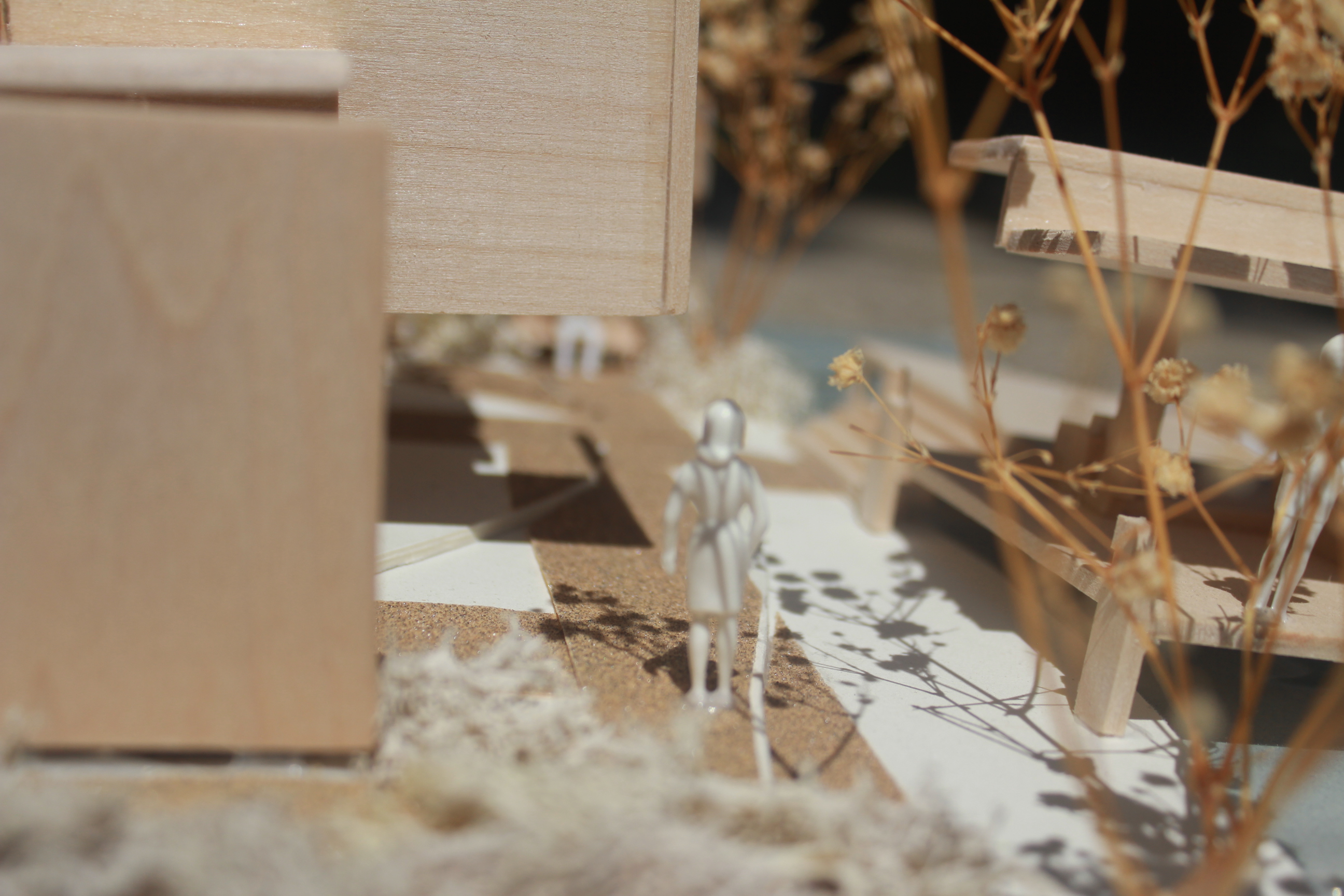

PROCESS
Tasked to create two pavilions, one public and one public. Deconstructing two simple boxes and only using 5 cuts and moves to create shapes that would act as the two pavilions.
Private Pavillion


Public Pavillion


FLOOR PLANS AND SECTIONS

Association of Collegiate Schools of Architecture
internship | summer ‘24
The Association of Collegiate Schools of Architecture (ACSA) is an international organization supporting architecture schools through peer reviews, awards, conferences, and design competitions. It fosters a network of faculty and schools committed to educating a diverse student body.
My internship with ACSA was a transformative experience that provided invaluable insight. ACSA is an international association of architecture schools, with the University of Pittsburgh as an associated chapter. Focusing on a resource for architects, designers, and instructors. Within the eight weeks, I learned skills focusing on graphic work and data analysis for their social media platforms (Instagram, Facebook, and LinkedIn). In addition to professionalism, time management, networking, and learning new software. This experience has influenced my perspective on future education and career aspirations.
MY DESIGNS
STUDYARCHITECTURE.COM


FINAL DESIGN
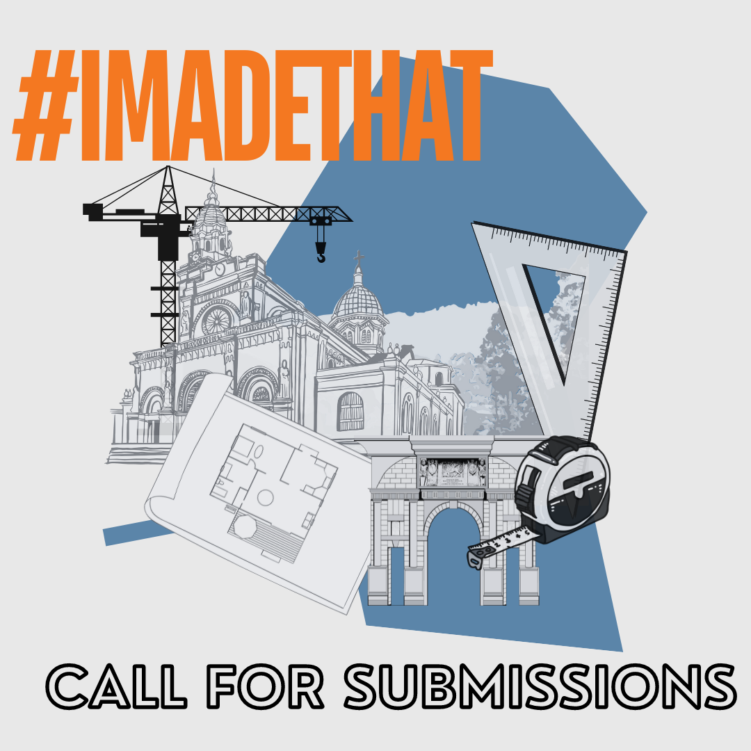
#IMADETHAT
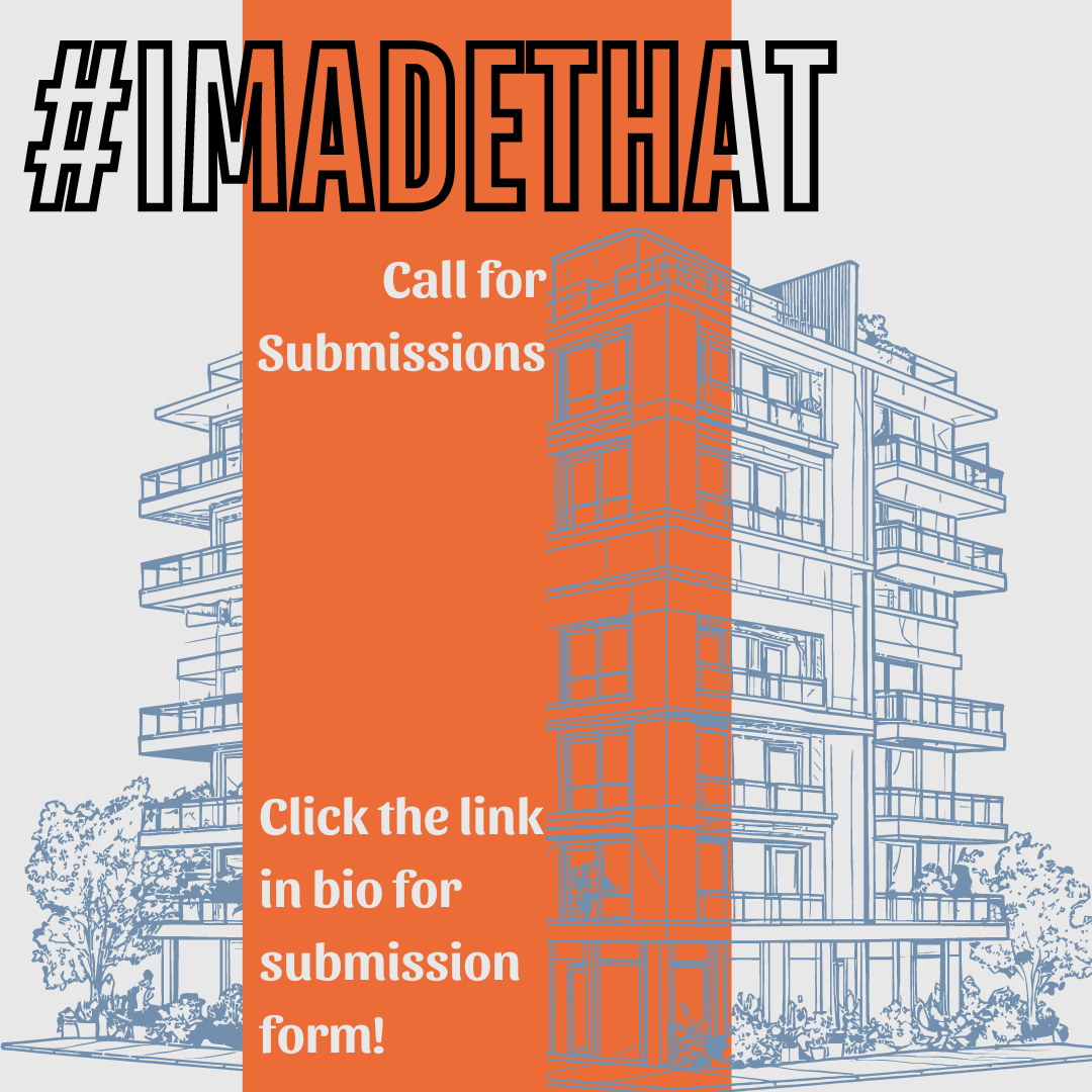

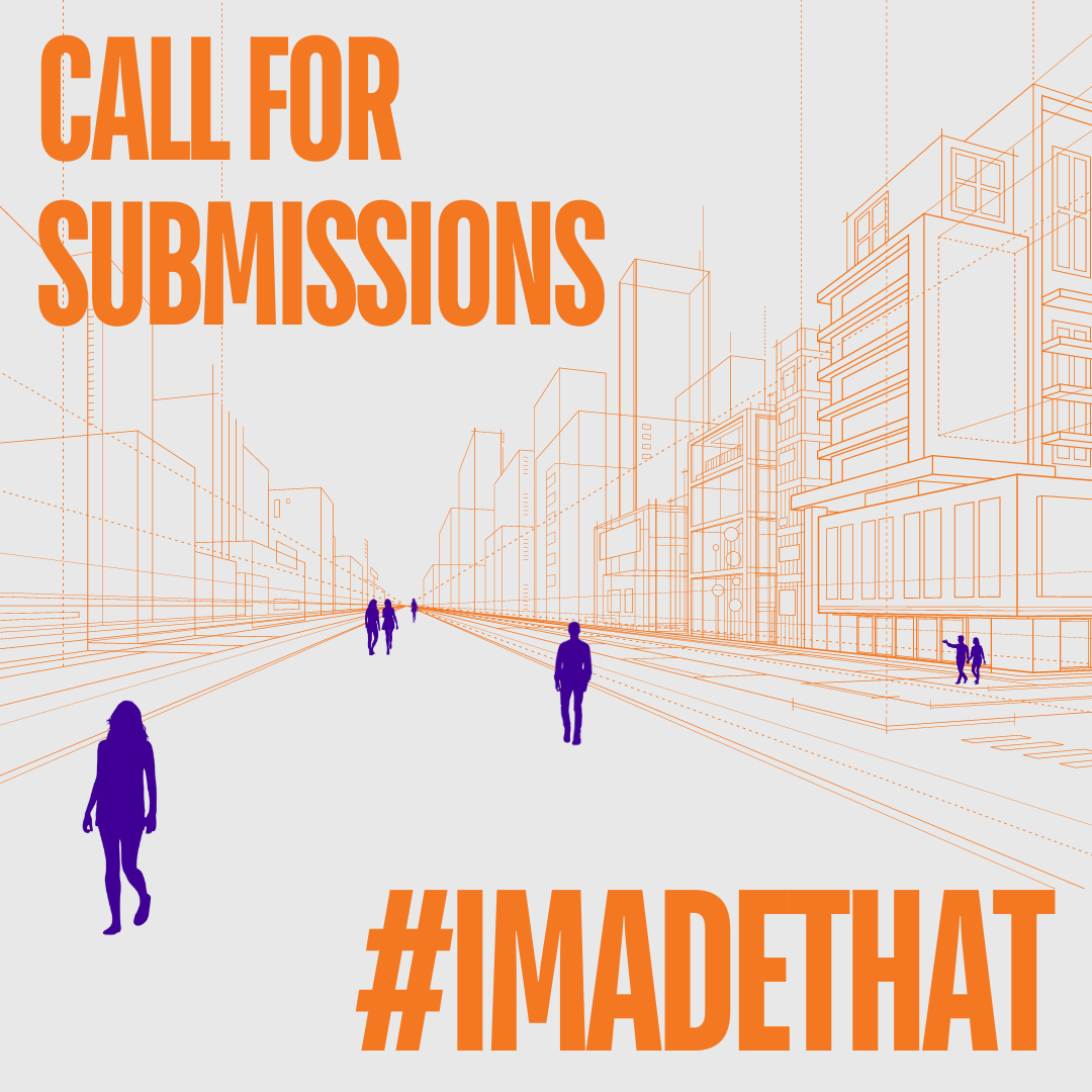
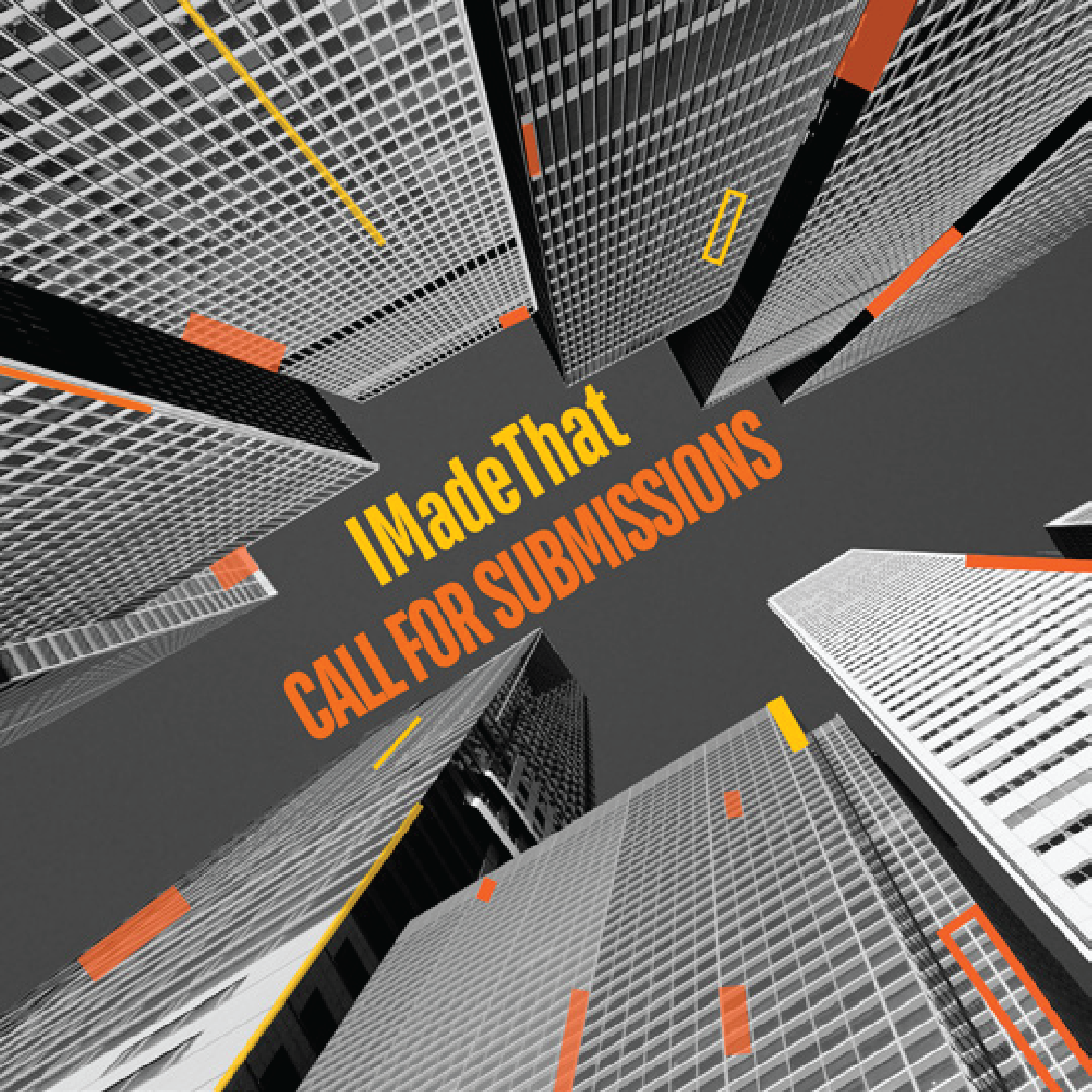
This graphic was made for @Imadethat_ Instagram to encourage students to submit their work to be featured on the Instagram page.
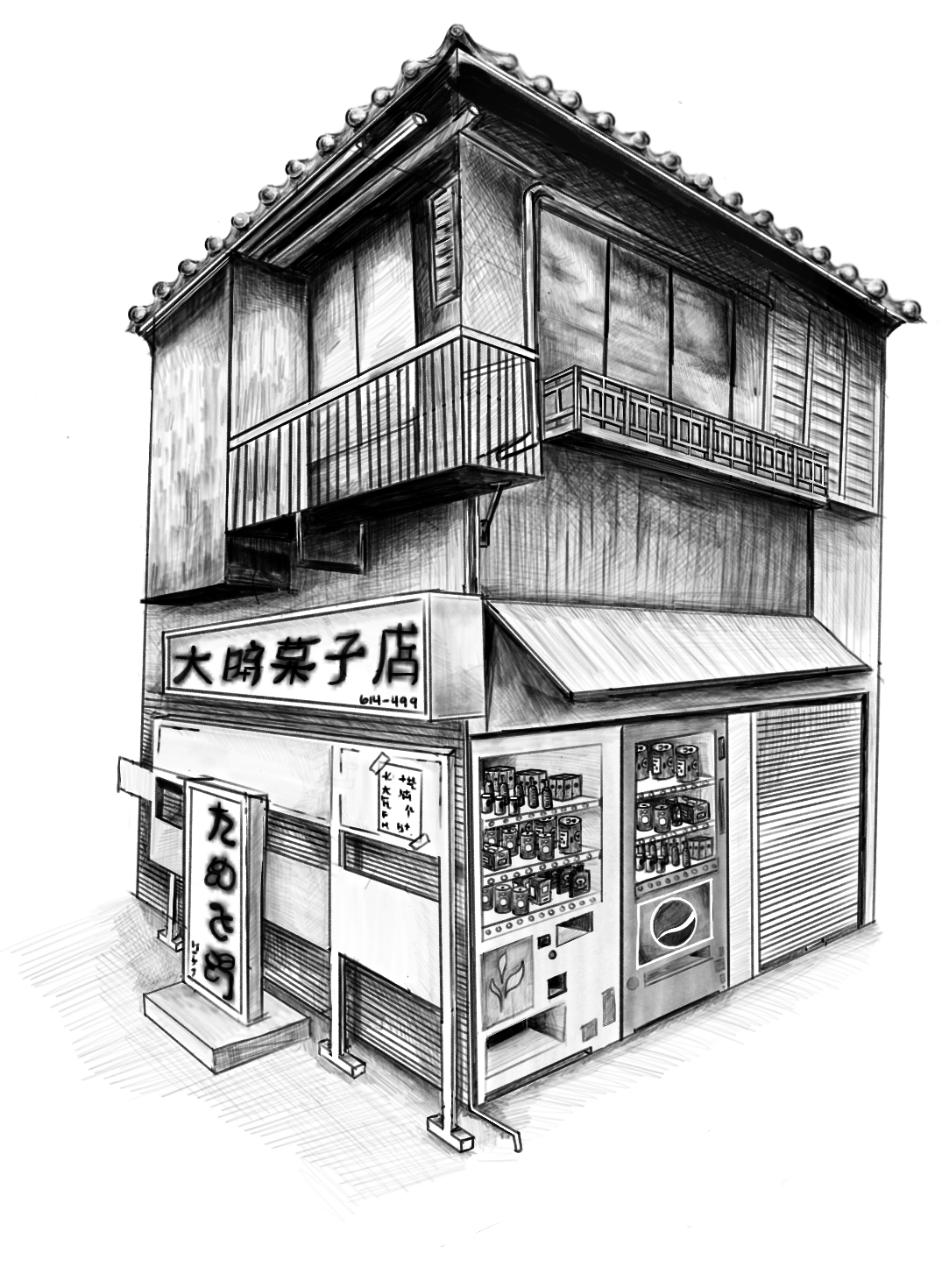
My Art!
My artwork has gone through many phases throughout my life. Experimenting with new media has varied my approach to each new piece, leading me to brainstorm different prompts and draw inspiration from the world around me.
Perspective of building, drawn digitally in Procreate.


This was done for Asian Student Alliance's (ASA) merch drop in fall '22. Inspired by ingredients that make up our favorite dishes that are made with love. This was printed on a hoodie.
 Still life study of my trash can, I was very intrigued by the crinkling of the bag and the bending of the letters.
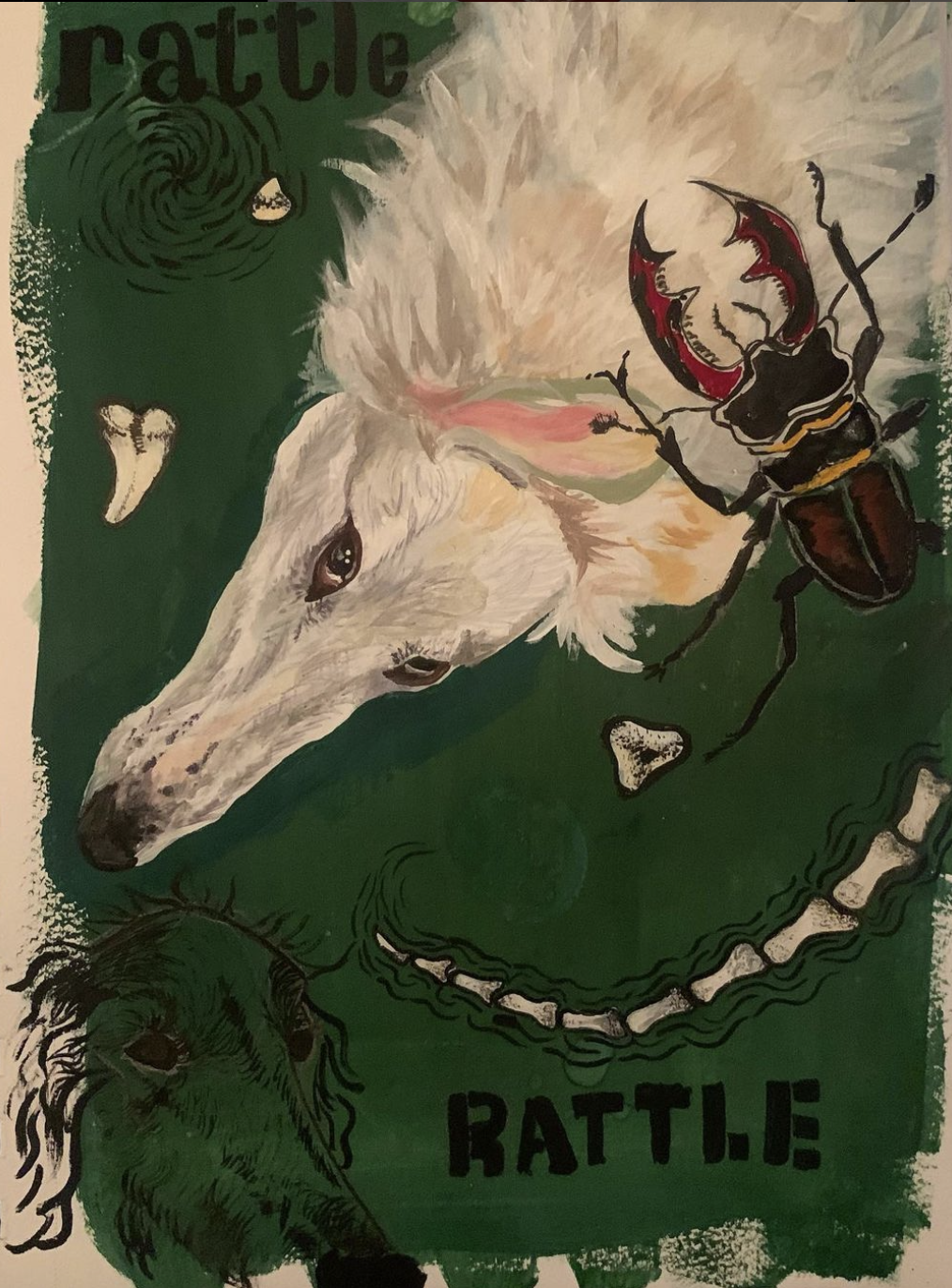
This work is part of my sketchbook, and it was made with gouache and a micron pen.
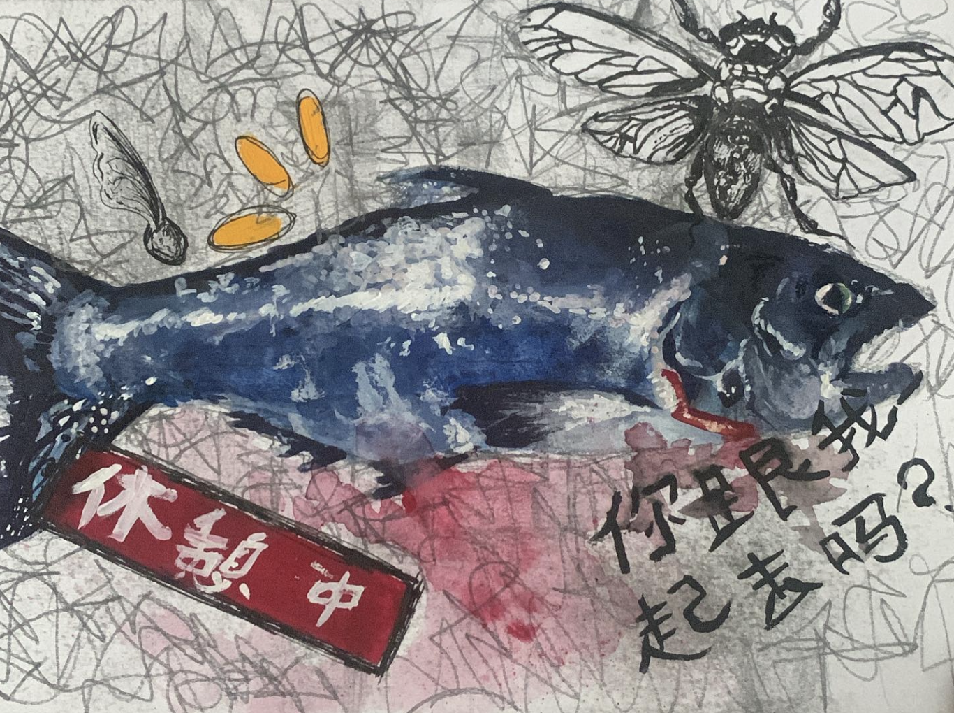 This work is part of my sketchbook and was created using gouache and pencil.
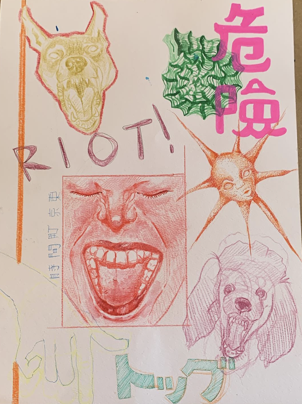 This work is part of my sketchbook and was created using colored pencils and pen.
 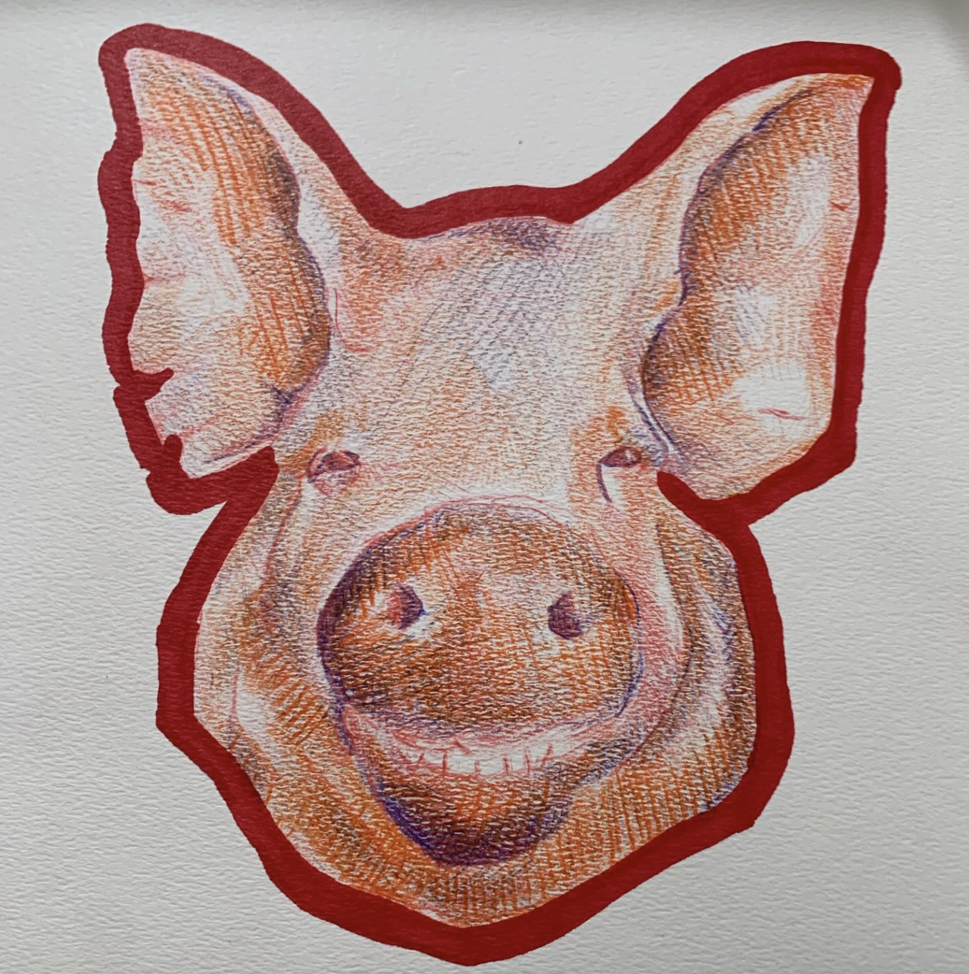 This work is part of my sketchbook and it was made with colored pencil and marker.
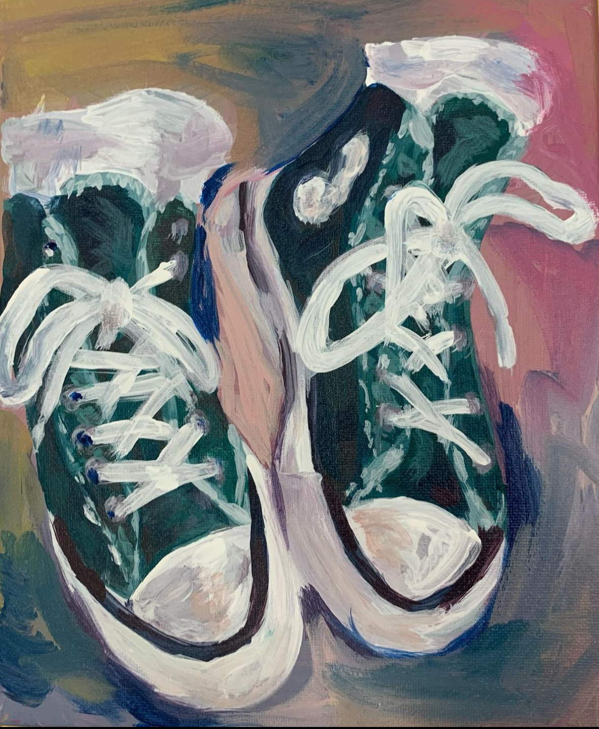
HIGHSCHOOL
This work is displayed on a small canvas and it was made with acrylic paint.
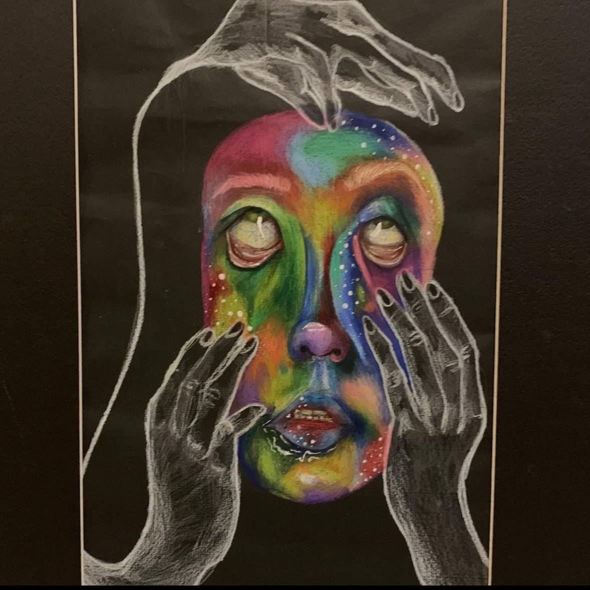 This work was done for a high sschool class project and it was drawn on black paper with colored pencil.
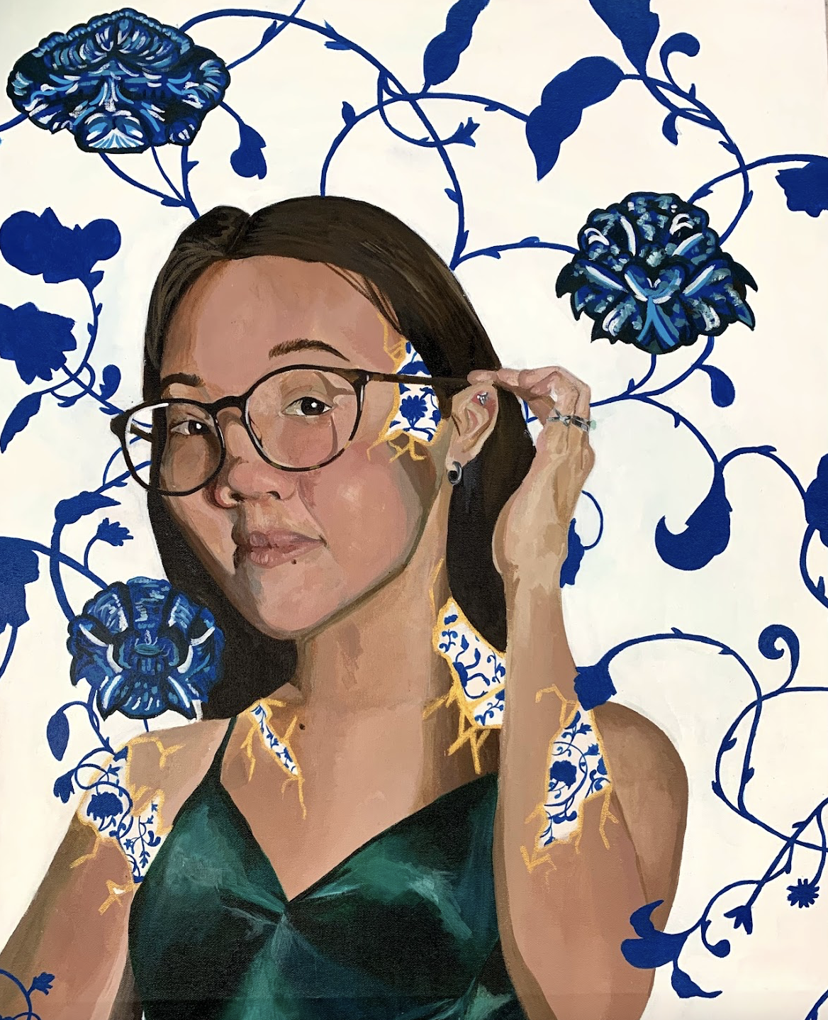
This was done for a high school project done on a large canvas with acrylic paint.